Let's get back to work on our visual problem. The problem is to visually represent three regional wineries for a magazine.
We've decided to shoot the subject in a studio style. We've turned in our list of supplies. Now let's fill in some gaps.
Studio space
As stated, the newsroom floor of the building was destroyed by the hurricane. Although the studio survived, all the equipment from the office is stored inside the space making it useless for work.
All the conference and meeting rooms have been temporarily converted into newsroom space. The entire photo department now occupies a former storage room. All foyers except the front foyer have been converted into temporary newsroom space as well.
However, the secretaries for news and circulation leave the building around 6 p.m. We can use the reception lobby of the circulation department once they leave. We'll need to improvise backgrounds and working space, but if tables, desks and chairs are moved out of the main pathways, it'll work.
Photos by Mark M. Hancock / © The Beaumont Enterprise
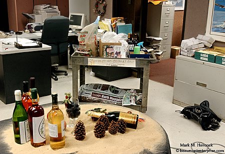
This is the location and design for the cover shot for Metropolitan Beaumont magazine in The Beaumont Enterprise circulation reception area in Beaumont on Thursday, Feb. 2, 2006. Note the receptionist's desk, paperwork and copier.
Background
Background is part of the overall concept. The options would be to use a seamless paper background taped to the wall, a table cloth or other patterned material.
I opted to use the actual wine bottles as the main background and tape up a black sheet to cover the wall. To accomplish this, I need to backlight the bottles to make them pop off the background.
Consequently, I'll need enough room between the posing table and the background to set a light at a low angle. This throws the background completely out of focus even at f/22.
Concept
I skipped my concept last time to let everyone consider the supply list. In order to accomplish this series of images, we must have a working concept rather than a random assembly of objects. This allows us to pre-visualize the final images and construct them from the images in our minds.
The concept is to use one aspect of the three wineries to set each apart. One winery claims to be the closest to the Gulf Coast. Another winery is in the Piney Woods. The final winery only makes fruit wines. We used these aspects to distinguish the different wineries from each another.
For the cover, we'll introduce all three factors into the image. The kicker image will have the wines in a tabletop display shot strait forward and lighted from behind. The inside shots feature a single bottle from each winery. Each has a strong diagonal design with a wine bottle, the winery's feature and a contrasting element of the wine.
The shoot
The magazine editor acquired almost all requested supplies and had them in the lobby. She couldn't find a live Caribbean hermit crab (fresh water, bright red), nor fresh champagne grapes. However, she did find realistic plastic and silk champagne grapes.
The original concept had the hermit crab chillin' under a drink umbrella. Without the crab, the umbrella was dropped as well. It was a cheesy idea, but it might have been cool
A lobby table was used as the posing table. To get the right elevation for the wine bottles, different height stacks of newspapers were placed under a black sheet. The bottles were positioned on the sheet to fit within the frame. Several layers of newspaper were taped into a circle to prop up the champagne bottle without showing. Then, sand was poured over the table to hide the sheet. The faux grapes cover the prop roll.
This configuration makes the kicker image.

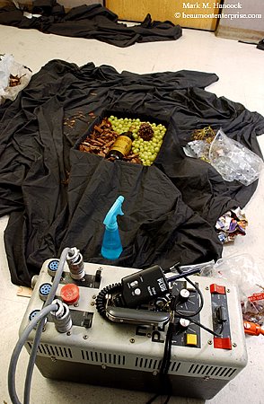
This is a reverse look at the location. It shows the lighting scheme and design for the cover shot for Metropolitan Beaumont magazine in The Beaumont Enterprise circulation reception area.
A large softbox was the primary light source. A newspaper taped onto a light stand made an adequate bounce card (the studio bounce cards are trapped somewhere). A snooted strobe head sat on a taped wine box behind the table to back light the bottles (I forgot my mini light stand).
I used The Beast as my only light source. It's remotely triggered with a set of Pocket Wizards to make wireless movement easier. The shutter speed is at 1/500 to completely eliminate any chance of fluorescent light spill over. The example images in this post are shot with available fluorescent light.
For the cover, fruit, wine glasses, shells and pine cones were added. The background bottles were reduced to five to make the frame vertical.
Once these two images were complete, the three interior shots were made in a box on the floor. The stir sticks kept the pattern accurate for all three images. At this point, the lights were both on regular light stands, pointed at the ceiling and each diffused with a regular sheet of copy paper.
The Beaumont Enterprise circulation reception area is the location. This is the product design for one of the three inside shots for Metropolitan Beaumont magazine.
See the final results here. Before you see the images, try to imagine how the final images will look. See if the results are the same as the image in your mind.
Enough for now,


No comments:
Post a Comment