
Betty Greenberg poses for a portrait at her home in Beaumont on Wednesday, Oct. 25 2006.
This version of a cover image allows room for a magazine nameplate, mailing label and story teases. Orientation is to the right.
Photos by Mark M. Hancock / © The Beaumont Enterprise for BE magazine

Betty Greenberg poses for a portrait at her home in Beaumont.
This version allows room for a magazine nameplate, mailing label and story teases down the right-hand side plus a breakout box on the lower, left-hand corner. Orientation is non-traditional. Her angle is left, but her eyes orient right.
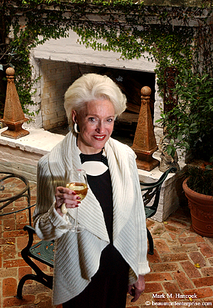
Betty Greenberg poses for a portrait at her home in Beaumont.
This is the best version for most publications. It allows room for a magazine nameplate, mailing label and story teases down the right-hand side plus a breakout box on the lower, left-hand corner. Orientation is to the right.

Paige Windham (left) and Betty Greenberg (right) pose for a portrait at Greenberg's home in Beaumont.
This version is the best for a traditional cover. It allows room for a magazine nameplate and mailing label. Orientation is forward.
We've talked about offering various layout options. Primarily, we've talked about horizontal and vertical layout options as well as subject orientation. These are common requirements of newspaper layout. However, newspapers don't (and shouldn't) place text within the image area.
If PJs are shooting a magazine cover, additional factors come into play. Text is commonly placed within magazine image areas. Cover images are almost exclusively vertical. Most magazines also tend to run more vertical images than horizontal images inside.
Although I haven't elaborated yet, it's important to have model releases on everyone and property releases for anyplace (non-public) appearing in images for a magazine. Although most magazines have journalistic protections, some don't. Don't take a chance with any of them; get the releases.
What magazines require
About 80 percent of all magazine rack sales come from cover design. Every element of a magazine cover is critical to the magazine's survival. Consequently, PJs must shoot exactly what's needed if they want to get a cover.
For the cover story above about sweaters for a specialty publication, I needed to present several options. All of the options needed to have extra space at the top of the frame for a nameplate. If the image runs inside, the top would be cropped to make the image into a square.
While traditional magazines only require nameplate space at the top, most modern magazines place text over the cover image to entice readers to the stories within. Frequently, text is placed on the right-hand side of the image. No matter how good an image is, it won't be used for the cover unless there is a place for this text.
Most Western-language magazines are bound on the left-hand side. Middle Eastern magazines bind on the right-hand side. This can present problems for some PJs in Europe, Africa and Asia.
Most American publications want the subject situated in the middle-to-lower, left-hand corner for cover consideration. Well-established magazines often float the subject over the nameplate, but it's not the preferred option for most designers.
Additionally, many glossy magazines require a mail label area in the lower, right-hand corner of the cover image.
When a magazine client lets a PJ know an assignment has cover potential, it's critical to make sure to keep these factors in mind (particularly if there's cover incentive money involved).
Once PJs are certain they have the cover shots nailed, they can move to inside shots. These are shot similar to newspaper images, but it's wise to shoot both horizontals and verticals of everything.
Previsualize the layout
New PJs and/or those wishing to branch out into editorial work need to start seeing these layouts when they look at a scene. Most PJs know how to previsualize the frame proportions when they look at a scene. Rather than looking at the subject, they see the edges of the frame.
Next, PJs learn to superimpose text elements over the scene. The remaining area is the usable portion of the frame. This is the area where the main subject must be located.
However, the remainder of the frame must still contain information. Although it's less important space, it's not "dead space." Some clients may use a square, oversized format. This really compresses the usable image area.
Orient right
Considering the information above, it's best to orient the subject toward the right (where the text is). Otherwise the subject looks toward the spine of the magazine and the layout folks might be tempted to flop the image. Although this is forbidden in newspapers, it happens too often on magazine covers.
Just for fun, select any famous cover model with a "beauty mark" (like Cindy Crawford). Go online or to the newsstand and see if you aren't confused after a few minutes about where the mark actually resides. It'll probably switch from side to side with each publication.
However, if every image is shot for the cover, an inside image may get flopped to accommodate inside layout. If PJs take the time to shoot both orientation options (left and right), then there's no need to flop an image. Since a lawsuit was successful due to a flopped image, I'll again emphasize the importance of model releases.
Enough for now,


1 comment:
I love your pix of Betty G and Paige Windham. As a former journalist and native of Beaumont, I had the pleasure of knowing both these women, first in a professional capacity which evolved into delightful friendships with both. Keep up the good, creative work.
Lisa Viator, Boynton Beach, Florida
Post a Comment