Showing posts with label Photoshop. Show all posts

Monday, August 04, 2008

Photoshop CS2 & CS3 tips

I still suggest the original steps for images where time isn't an issue and quality is important. The steps are accurate and largely predictable and tend to produce consistently professional work.

It's also best for new PJs. The following steps are designed for PJs who've been at this a while (and can manually fix problems) and own a newer version of Photoshop.

The Photoshop program has evolved since my first post, so I'll address useful new features. With CS2 and CS3, there are some amazingly fast options for deadline PJs trying to crank out images fast or a high volume of images (for slideshows or freelance "event" photos).

These options won't work on all images. Again, if any step doesn't look correct, back up in History and work the image the "old fashioned" way from the point it strays.

CS-2&3 adjustments:
Open a generic .jpg file and crop to taste. Create the following Actions to maximize process speed:
1. Auto Color (Shft+Ctrl+B)
2. Set Shadow/Highlights (the Ansel Adams button)
      Shadow = 1
      Highlights = 4
3. Set Brightness / Contrast (for deeper blacks)
      Brightness = -1
      Contrast = 4
4. Set Unsharp Mask (as final step once image is fully toned)
      Amount = 110%
      Radius = 0.5 pixels
      Threshold = 0
If you're really lucky, the generic image should look good. Add 3 | 0 | 255 to the Input Channel in Levels, and you should be done. Save As (rename), put the Actions back into Button mode and move to the next image.

For extra speed, combine all the actions above under a single button and lable it "Feeling Lucky." If you're truly lucky, the one button will do it all. If not, back up through the History to find the problem and manually continue from there.

I'd also suggest creating a Similar, Grow, Feather button to fine tune the highlights and shadows to taste.

The five action buttons should be able to handle most images. They can be combined into a batch command (or the "Feeling Lucky" button) with a catch folder to handle most high-volume assignments efficiently.

In these circumstances, Copy selected images into an additional folder to protect the originals before starting the batch command. Go through the output folder and check for incorrectly-toned images. Redo those images manually the original way.

Enough for now,

Tuesday, December 27, 2005

Photoshop Shape tool tips

Photoshop features various custom shape tools. Later versions contain the shapes we'll discuss today (sorry 3.0 users). These can be laid over an existing image, sized and embedded into the image itself. This is useful for preserving copyright, pointing out particular parts of a photo (arrows) or various other "artistic" aftertreatments.

As always, it's critical to save the photo with a new name (Save As) before we work with an original image. Otherwise, the original is gone forever. Hopefully, the original is already on a read-only CD, so there's no way to write over the original information.

Copyright
The copyright custom shape tool is probably the single most useful custom shape. This shape lets others know an image is owned and use requires payment. It completely eliminates the "I didn't know" excuse.

It's best when combined with a photographer's name and Web site. Then, there is absolutely no excuse for copyright infringement.

Although the shape can be moved until the image is flattened, it's best to add text first and then add the shape tool (for sizing and placement reasons). To move the shape at any point, select the Move tool (quad-arrows) from the toolbar. Drag the layer where desired.

To use the custom shape tool, open an image in Photoshop. Choose the custom shape tool (it looks like a splat on the toolbar). Click on the arrow next to the shape indicator at the top of the screen. Choose the © symbol (by the way, the html code for this symbol is "& copy" without a space between them).

Once the shape is chosen, click on the top bar of the image. Move the cursor to the desired location for the symbol. Click, hold and drag the mouse toward a lower, right hand corner until an appropriately size © appears. The © appears as the mouse is moved.

To change the color of the ©, click on the Color box at the top of the page. Select a desired color or create a custom color with the RGB controls.

Once the text and © symbol are in the desired location, choose Flatten Image from the Layer options. Save.

Rule of thirds
This part may seem random, but it'll make sense when I post about composition.

Photoshop features a rule of thirds custom shape tool. This can be laid over an image to assist with cropping to the rule of thirds or checking an existing composition against the rule of thirds.

To use this tool, open an image in Photoshop. Choose the custom shape tool (it looks like a splat on the toolbar). Click on the arrow next to the shape indicator at the top of the screen. Choose the rule of thirds grid (it's often the last shape offered).

Once the shape is chosen, click on the top bar of the image. Hit the Caps Lock button to change the cursor to precise. Move the precise dot to the upper left hand corner of the frame. Click, hold and drag the mouse toward a lower, right hand position. The grid will appear as the mouse is moved.

Adjust the grid to a desired composition. The goal is to have a primary subject item (an eye for example) on one of the four inside intersections or the horizon line inside one of the outer thirds. Change to the crop tool. Crop around the exterior of the new composition. Double click to set the crop.

Open Layers (under Window) if not already open. Select the custom shape tool layer. Click on the upper right hand arrow. Choose Delete Layer. The composition now conforms to the rule of thirds. Save.

Enough for now,
 

Sunday, May 15, 2005

Make a digital illustration


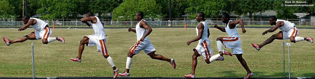
Photo Illustration / Mark M. Hancock / © The Beaumont Enterprise

Port Arthur Memorial High School's Jamaal Charles demonstrates his hurdling stride at the school on Thursday, May 12, 2005. (Click on the image to see a larger version. Click on it for an even larger version.)

This illustration contains six different individual frames of Jamaal Charles. He's an outstanding athlete with great potential. I photographed him two weeks ago when he beat the No. 1 and No. 3 nationally-ranked hurdlers during the Region III Track and Field Championship meet in Humble (near Houston). This weekend, he won the state 5A championship.

As you might guess, this image created a little buzz at the office. Mostly the questions were about how it was done. I'll explain why it was done, then I'll explain how.

But first, let's discuss the role of ethics in photojournalism as it applies to digital manipulation of images. I believe all digitally manipulated images should have the designation "Photo Illustration" to differentiate them from photojournalism. Moving image elements (pixels) without disclosure is the visual equivalent of a lie. It's contrary to photojournalism, which aims to show the truth.

Although there are times when a photo illustration is appropriate, it's best to avoid them and use them only when there is no better way to tell the story.

Why it was done
This assignment was designated as "hot," meaning they needed it quickly for the next day's newspaper. The story idea was to explain the stride and steps a champion hurdler takes from one hurdle to the next.

I could have shot it as a straight sequence to show the stride and distance. However, the track configuration at the time of the shoot would have placed the hurdler's face in shadow instead of light. His skin tone was not reflective enough to handle the two-stop difference. Additionally, a straight sequence would take more space than needed and still wouldn't accomplish the explanation.

My options were:
1. Shoot whatever he did during his normal practice, have his face be lost in the shadow, and possibly not get what I needed anyway - not a good option.
2. Fake the scene (subject manipulation) and have him run into the light several times until I had a good sequence - an IMPOSSIBLE option for my ethics.
3. Make an illustration where I had exactly what I needed while fully disclosing the situation as an illustration with subject and digital manipulation.

Consequently, I committed to a photo illustration to keep on ethical high ground.

Previsualize the final image
To shoot an illustration, the PJ must previsualize the final image. This means the PJ considers the various obstacles and understands what elements are required to accomplish the desired final image. It also makes the PJ consider camera angles, light, background elements and other factors, which could weaken the final image.

For this image, I knew the hurdler must run into the sunlight to have facial details. I also knew I needed enough room to back up and shoot it flat with a longer lens. Furthermore, the background needed to be neutral rather than the high key (which the visitor's stands would have created).

The only area of the track which accomplished the majority of these needs also contained the shadow of one of the light poles. In a perfect world, we would have waited for the shadow to pass from the hurdling area, but we were on a tight timetable.

Ideally, I would've gotten a ladder to use the football field turf as a background, but this was a last-minute decision and no ladder was available. We did what we could with what was available. Sometimes it's how news PJs must do things.

Correct lens angles
This image required me to "shoot it flat." Flat sequences are different than panoramas because the camera moves as well as the subject. In a traditional panorama, the camera is stationary while the subject is either stationary or moving. A panorama thereby creates a curved distortion caused by changing camera angles. I have an admittedly rough example here.

Shoot for the final purpose
Because it was for an illustration, I asked the athlete to run the hurdles four times. I included most step sequences from one hurdle to the next to show the distance traveled, the stride and the number of steps involved.

The second step is missing because it would have crowded three images into an already tight portion of the image.

The images were shot with a 200mm lens from three different locations along a fixed path (two frames per position). This set the background at the appropriate angle. I can't overemphasize the importance of shooting the right image angles to create the final image.

How the digital image was done

The remaining steps are done in PhotoShop. When processing the images, it's best to handle the whole batch in its original files before color correction. Then, the color corrections are consistent throughout the whole image.

Set the canvas
First, open the base image in PhotoShop. This sets the image to the extreme right or left of the final image. I chose the right-hand image because he was running to the left.

Next, choose Image and then Canvas Size. A pop up window appears. Choose the Anchor quadrant from the 10 options to set the base location. Then increase the height or width to slightly more than expected for the final image's size. Then choose OK. This increases the canvas size to the new dimensions and includes the base image.

Save often
Throughout the process, much of the computer's random access memory (RAM) is used. The likelihood of a computer crash is good. Consequently, folks should Save their work after each completed step. This creates much less stress when the computer does eventually crash.

Once layers are introduced in the next step, the image suffix converts from a .jpg (joint photographic expert group) to .psd (PhotoShop Document). The file size also dramatically increases. The advantage of this change is the image doesn't lose information on each additional Save.

The .jpg protocol compresses the file upon each Save and ultimately degrades the image. However, once the image is completely assembled, it's best to Flatten the layers and Save the final document as a .jpg image to compress the overall image for storage.

Working with Layers
Anytime more than one image, text or graphic element is introduced into a PhotoShop image, a new Layer is created. On extremely complex images, it's best to choose Layer and Flatten Image at each major project point to cut down the size of the total PhotoShop image.

While working with layers, it's possible to become confused because all layers appear simultaneously as a two-dimensional image on the screen. To distinguish between layers, choose Window and then Layers to see the set of options. As each layer is chosen from the list, it moves forward in the master image. This doesn't mean it appeared this way when flattened. It only designates which layer is currently active.

After several attempts, it becomes easier to learn the layering patterns and how to use them appropriately without confusion.

Place a second image
Next, open the second image in the series. Select all and copy the image. Paste the image onto the original image. It should appear in the middle of the canvas. Use the Movement tool (on the toolbar it looks like arrows pointing in four directions) to set the image where it belongs according to all image elements.

If the image is "simple," the image elements align near the edges with a slight overlap to allow placement. If the image is complex - such as this one - locate guide points (landmarks) within the image to determine what must be covered or revealed in either the forward or back image layers.

Once the guide points are determined, choose Window and History and delete everything from the last Paste command. Save.

Paste options
Now it gets tricky to decide whether to layer the top image over the bottom, the bottom over the top or a combination of both. Often the primary subject and background determine needs.

  • Past Into
  • This option keeps image elements from the existing file in front of newly introduced images.

    Using the Lasso tool, select the area to remain forward in the original image. Then, select the remainder of the original image area(s) to keep. The remaining portion of the image(s) could be overwritten (depends on the incoming image).

    Because the selected area is the area we want to protect, we must choose Select and then Inverse. This actually chooses all remaining portions of the image and canvas. Now, choose Edit and Paste Into options to place the new image or graphic element. It must be moved into position, but it slides behind the originally selected areas.

  • Paste over
  • This option selectively places image elements over the existing file.

    On the image to be introduced to the master file, use the lasso tool to select areas to be introduced to the master file. With this illustration, I selected the whole image and subtracted the areas I didn't want to overwrite. The same effect is accomplished either way.

    Once the area is selected, Copy the area. Change back to the master image and Paste the copied area. Move it into position. The copied area has the shape selected in the first image. It moves over the existing image(s) and becomes the top layer.

    Continue the process
    Continue the copy and pasting process until the images fill the blank canvas area. If additional canvas is needed, simply increase the canvas size in the required direction(s).

    Finishing touches
    Once all the pieces are assembled into the master document, Flatten the image. Save the image.

    It'll probably have a ragged edge. Use the Crop tool and crop off the ragged edges to make the image appear complete. Then color correct, sharpen and adjust as needed.

    Once the image is absolutely completed, convert it to a .jpg and Save the final image for storage.

    Enough for now,
     

    Saturday, January 29, 2005

    To tilt or not


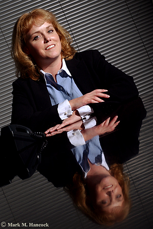
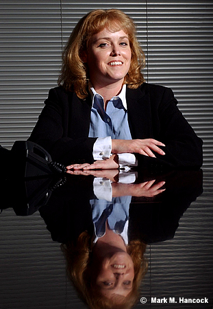
    Heather Ainsworth, division director of Robert Half Finance and Accounting, poses for a portrait at her office in Dallas on Monday, November 22, 2004. She manages a group which specializes in full-time placement of accounting professionals.

    Photos © Mark M. Hancock and The Dallas Morning News


    These are images from a tough situation. I could only shoot in their conference room. Compositionally, it's further complicated by having only one subject.

    I tried to make the image more interesting. I snooted the light, I used her reflection on the polished wood table and I even tilted the frame. The non-tilted image ran as expected.


    I'll admit a tilted view makes a boring image more interesting. There's the problem. Tilting a view is controversial to PJs because it makes a boring image more interesting.

    The general composition rule is horizontal lines are horizontal and vertical lines are vertical because this is the way people see. Leading lines can be diagonal because they imply distance.

    For those who tilt frames (deliberately turn the camera to violate the compositional norm), the rule is abstract and artificial. The rule can be considered a nuisance or an outright affront to creative expression.

    For traditionalists, tilting frames is sloppy and unprofessional.

    For most working PJs, it just happens. At other times, it's a tool to keep in the bag for when it's warranted. Sometimes it works, sometimes it's sloppy. Each image dictates its applicability.

    To tilt
    Most PJs have it hammered into our heads to make any situation visual or don't bother coming back to the newsroom. It's the PJ's job to sift through the scene and locate the single interesting image. When there is absolutely nothing – an extremely rare occurrence - a tilt may be warranted.

    On equally rare occurrences, a tilt could be the only way to keep all visual elements within a frame. In these circumstances, the only other way to keep all the elements is to back up too far and include too much extraneous information that the image is degraded.

    Lastly, the most legitimate use of a tilt is chaos. The PJ is running to or from something horrible and the camera was tilted due to other actions of the PJ. It's not a deliberate tilt as much as the PJ is darn lucky there are any useful frames at all.

    No tilt
    The strongest argument of the no-tilt camp is sloppiness or lack of creativity on the part of the PJ. If the PJ didn't work the situation hard enough, they may have simply tilted because it was an easy or faster way out of a situation.

    In the viewfinder of most decent cameras are lines. These are normally part of the ground glass and vary from a single straight line with serifs to a complete grid. Many modern cameras allow the ground glass to be replaced with either preference.

    While viewing the scene, PJs can align these guides to known standard bases to set the orientation and alignment of the frame.

    To double check the tilt, most decent tripod heads have integrated bubble levels. I wouldn't suggest limiting the composition to where the bubble aligns, but it's a tool to use when the scene itself is somewhat askew.

    Reasonable rule
    Personally, my predilection is toward the no-tilt side. However, I understand compositional rules are meant to be broken at the right time with the right knowledge. A reasonable composition rule maximizes the use of the frame.

    Locate one item within the frame to justify the vertical or horizontal pitch. As an example, it's relatively acceptable to match the frame tilt with a particular spoke of a bicycle tire or tree branch. Although the remainder of the frame is “tilted,” there is a defined “base” for the tilt.

    Along this same line, when shooting ultra-tight, a tilt maximizes the frame by keeping the subject's main facial features within the frame while cropping the remainder. However, I'd still suggest some traditional frames before returning to the newsroom. If the tilted frame is interesting enough, an editor might be convinced with logical evidence to use it.

    How to align in PS
    There are two ways to align images in Photoshop. The measure tool method is easiest and most reliable. The crop box method is often required when multiple angles and/or a wide-angle lens are at play. Although it isn't as exact, it often looks better because the PJ determines what looks correct considering all the variables.

    Measure tool method
    As stated, this is the most exact method to align an image. It's often the easiest method when longer lenses are used because angles have less curvature.

    While the file is open, move the mouse over the eyedropper tool. Click and hold the mouse until the alternative tools appear. Select the measure tool (it looks like a ruler).

    Chose a straight line (vert or horizontal) within the image to use as a plane base. A longer line leads to a more accurate rotation. Move the cursor to one end of the line. Depress the mouse button and move the mouse to stretch the line across the entire length of the plane base. Release the mouse

    To adjust the line, use the mouse to grab and move the plus symbols on the ends of the line.

    Once a straight line is produced in the appropriate place, it's time to rotate the image. Go to "Image" and select "Rotate Canvas" then select "Arbitrary..." When the dialog box appears, it'll be set for the accurate angle rotation and direction. Hit "OK."

    The image should now appear straight as set by the plane base. If not, "Undo" the rotation and try again until it appears visually correct. With ultra-wide images, very few things are going to be "straight" due to barrel distortion. As long as the crop line intersects a curve at an equal distance to maintain symmetry, it's close enough.

    Next, crop the excess (background colored areas) from the image. The image is smaller, but it is properly aligned.


    Crop box method
    Because many tilts are accidental and only slightly off level, it might be best to align the frame in Photoshop before the final edit. The process is easy.

    While the file is open, create a crop box. Stretch the crop edge along a chosen line (vert or horizontal). A longer line leads to a more accurate crop. Move the cursor outside the crop box until it makes a curved symbol. Depress the mouse button and move the mouse to rotate the crop box until the edge aligns with the chosen base line. Release the mouse button.

    Next, stretch the crop box edges until they form a good crop while remaining completely within the image area. Move the cursor within the crop box and double-click to set the crop.

    The image should now appear straight as set by the base element. If not, “Undo” the crop and try again until it appears visually correct. With ultra-wide images, very few things are going to be “straight” due to barrel distortion. As long as the crop line intersects a curve at an equal distance to maintain symmetry, it's close enough.

    A Leeson lesson on tilts
    David Leeson is known to tilt some frames. He wanted to voice his view on this subject as well.
    The issue is to get your mind off it. It’s not about whether you tilt or don’t tilt. For me personally, it’s simply shooting in a way that communicates most effectively. With that said, I think people use tilting as a gimmick.

    It’s so obvious they simply tilted the image because it makes it look cooler. I have a bigger pet peeve than that. I have a much bigger one and that’s people who put those really cool little black borders around all their stuff. These are digital images and they’re putting them like it’s a film edge. It almost always makes the image look cooler.

    I just don't like gimmicks.

    I've been guilty of it myself many times – using a gimmick. But I hate it whenever even I do it. I despise it. I look at myself and say, 'That's disgusting. Why'd you even do that?'

    It's because you didn't want to give it the extra effort or you were completely, flat-out busted and couldn't think of anything else. You just didn't know what to do. You're stuck. It's a lack of confidence.

    It's not knowing how to follow a story. You just didn't approach it right.

    Think of some of the world's greatest images and then think about if they would be better if you tilted them. We don't do that. Do we?

    On the other hand, think of some of the world's greatest images that are tilted. You'll find out when you look at those, they're not tilted because someone wanted to use a gimmick. They're tilted for a purpose or reason. Maybe it's because the photographer was running like hell. Maybe it's a grab shot. The whole point was that it was supposed to be from the hip, and it's supposed to have that kind of feeling. In other words, the photographer isn't even thinking about whether they were tilting or not.

    A lot of the tilts that you see in my images, I'm not purposely tilted. I don't even notice it because I'm shooting quick. I shoot from the hip a lot.

    I used to challenge young photographers to try sometimes on an assignment instead of seeing the image, try to feel the image. Try to shoot by what you feel, not what you see. Get rid of what you see. Practice actually experiencing the feeling of that situation.

    A lot of times when I was doing that, I wasn't even looking through the camera. Obviously, it wasn't always straight either because I'm not lining it up.

    I don't really think about it myself. I have some tilts. Sometimes I don't. I don't really know. But, I do not ever knowingly say, 'This would look cooler tilted.' I just don't do that. I don't even think about it.

    If you look at Eugene Richards, his stuff is tilted like crazy. Now, he's an amazing photographer, no one is going to question the brilliance of Eugene Richards. Yet, so much of his work is tilted.

    But if you really study those images, you'll see that it's tilted for a purpose. Look at what he included in the frame. Those tilts have a purpose behind them. I promise you, go and look at that work. It’s absolutely amazing because you can see how the tilted frame included some detail in the frame – additional content perhaps – that helped make the image.

    The only way he could have got it in there using the lens length that he was using would be to tilt it. You'll see it. So it's not a gimmick.
    Enough for now,
     

    Wednesday, July 28, 2004

    Add text to images


    Dancer Lori Barber (right) and musician Greg Fiellin (left) pair up for "Harlem Nocturne" during a performance of "Swing" at Bass Hall in Fort Worth on Tuesday, June 10, 2003.

    Mark M. Hancock / © The Dallas Morning News


    When I was preparing my entries for the Katies, so were some other staffers. The instructions were a little vague, so we decided to include paper proofs of our images and cutlines with the CDs.

    I'll explain the process for anyone else who wants to know. It's important to remember the cutline becomes part of the image (a jpg, tiff, eps, etc.). It isn't a text block as Quark XPress or the other layout programs would create.

    A big advantage to embedding text as part of the image is increased copyright protection. If a copyright symbol (©), name and date are part of an image, someone else can't claim ignorance in a courtroom. The infringer would have deliberately misused the image and can be slammed for heavy damages.

    Here's how to do it:
    • Open the image in Adobe Photoshop.

    • Prepare the image as needed.

    • The image should be in the correct orientation (horizontals are, verts are).

    • Using the drop-down menus, go to Image, then Canvas Size. A dialog box appears.

    • Increase the Height by 4 to 6 inches. This adds to both the top and bottom of the image.

    • Using the Crop tool, remove any undesired section (top or bottom) by excluding it from the crop area (crop includes the image and the main text area). Crop.

    • Select the Text tool from the tool box (it's the big "T"). Mouse the tool over the text area and click. On older versions, a dialog box appears. On newer versions, the text can be typed directly into the area.

    • Set text font, size and color.

    • Type desired text. Use Return to break lines because it's not text, it's raster characters, which look like text. Close the dialog box, or choose the Lasso tool and make a circle to set the text.

    • Crop off the remainder of the unused cutline area.

    If you need a print, Size the image (Image, drop down to Image Size) to fit the paper size. If the image is horizontal and you want to see it as a landscape print, rotate the entire image and size to fit the paper.
    Print.

    Enough for now,

    Sunday, June 13, 2004

    Photoshop hints can save some screams

    Many people have Adobe Photoshop for work or play but don't know how to use it for a quick color correction and prepress. Consequently, they take whatever the scanner hands them (typically a flat, lifeless version of reality).

    Although there are many adjustments possible, here's a fast set of basic controls to make bland images pop. These are the immediate actions I use when I'm on deadline and have little time to deal with prepressing the image. This could save someone 10 years of deadline stress along with the associated screaming and cursing at a computer screen. It works on digital camera images as well as images scanned from negatives.

    I tend to use numbers instead of eyeballing images because it saves time (especially on slow computers with low RAM) and increases my confidence about the final result without looking much at the actual image, which is different on every non-calibrated monitor.

    If you know what you're doing, here's the speed readers version:

    Open. Ctrl 0. Crop. Ctrl M. Auto correct. Save As. Ctrl M, set black point, white point, gray point on black. Ctrl L, set input levels at 10 | 1 | 240. Save. Select highlights. Feather. Invert. Try contrast at 6 (adjust to taste). Select shadows. Feather. Ctrl L, try 3 | 1 | 245. Save.

    This version should be small enough to print and tape to a monitor.

    Here's the very long version:

    Open Photoshop.
    Choose and Open an image file.
    Simultaneously press Ctrl and the number 0 to fit the image to the screen.
    Crop the image to the best composition and size.

    Simultaneously press Ctrl and M. Or, choose from "Image" the menu bar, then "Adjustments," then "Curves" to get the same subscreen.

    Move the mouse cursor over "auto" and click. Sometimes this is good enough for most people. However, it occasionally really messes things up. If it does, choose "cancel" and perform the following steps without the initial automatic adjustment. If the auto adjustment is fine, choose "OK" and move to the next step.

    Save (Save As) the image onto your hard drive/desktop (particularly if the computer doesn't have a lot of RAM).

    Simultaneously press Ctrl and M. Or, choose "Image" from the menu bar, then "Adjustments," then "Curves" to get the same subscreen. This time, we're going to set the image's black, white and gray points. As your skill improves, use the magnifying glass to enlarge areas for the most precise pixel selections for the following.

    Set your mouse cursor directly over the center of the diagonal line on the curve. Press and hold the mouse as you drag it toward the lower right corner. The image should appear to fade and become brighter. If it becomes darker then your controls are set opposite, so move the cursor to the opposite corner. Release the mouse when the darkest parts of the image are barely visible. The darkest of these points is your black point.

    Move the mouse cursor over the black eyedropper on the right side of the "Curves" dialog box. Click. Now move the cursor, which should be shaped like the eyedropper (hit the Caps Lock key if you want more precision), over the darkest point of the image and click. The image should look basically like it did before, but slightly darker and with a little more umph to it.

    White point is tricky because you must choose the white point without the help of moving the entire curve. Select a pixel which is most likely pure white and set the white point with the white eyedropper. The color probably shifts to something horrible, it's fine, we're about to fix the gray point.

    Gray point is often the most difficult to set because it's subtle. By definition, gray is a color with a neutral hue between white and black. The best way to set the gray point is to remember the exact position of the original black point and use it as the gray point. Since black is also gray, it color balances if the original black point is used as the gray point as well. If the color seems to still be off, try setting the gray point in a shadow area of a known white, black or gray area. Be careful about over adjusting gray if you aren't certain about the calibration of the monitor you are using.

    If you like it, choose "OK." If not, choose "Cancel" and try again until you're satisfied.

    Next, simultaneously press Ctrl and L. Or, choose "Image" from the menu bar, then "Adjustments," then "Levels" to get the subscreen. Manually set the input level numbers at the following 10 | 1 | 240. This takes some of the flatness out of the image by compressing the image range. It makes light areas brighter and add some depth to the dark areas while adding an overall contrast. If you like it, choose "OK." If not, choose "Cancel."

    Save the image.

    Next, we're going to hold the detail in the highlights while recovering some detail to the darker areas of the image. There are two ways to accomplish this. I'll explain both. When I have time, I use a combination of both to balance the image for maximum detail.

    Move the mouse over the tool bar. Select the magic wand tool. On a PC machine, look at the top of the screen for the word "tolerance." It should be at 36. If not, hit "Enter" on the keyboard and change the number to 36.

    On Mac machines, hit "Enter" on your keyboard. A subscreen appears with the settings for this tool. Set the tolerance at 36.

    With a good setting, move the mouse over an image highlight. Click the mouse. You'll notice a shimmering line appear around the highlight area. If it's in the wrong area, hit Ctrl Z or "Edit" then "Undo Magic Wand." Try again.

    To select additional highlight areas, hold down the shift button while moving the mouse over those areas. Each additional selection can be undone. If it's all wrong, click anywhere outside the selected image and it all disappears.

    A faster way to do this is to select a highlight area. Then choose "Select" from the menu and "Similar." This can be done several times as needed.

    I also like to choose "Select," then "Grow" to expand the range for pixel variations. This could occasionally cause some strange selections, so be careful before the next "Similar" after a "Grow" command.

    Once the highlights are selected to your satisfaction, we need to make the following adjustments blend gracefully. Simultaneously hit Ctrl, Alt and D for a Feather Selection dialog box. Or, from the menu bar, choose "Select," then "Feather." Set the feather radius to 15 pixels for most standard images. Use a smaller number if the image is much smaller. The point is to smooth out the selection lines.

    Once the selection is feathered, choose "Select" then "Inverse," or simultaneously hit Ctrl Shift and I on the keyboard.

    I prefer to hide the selection lines to see the results more accurately. To hide the selection, simultaneously hold down the Ctrl and H keys.

    Next, choose "Image" then "Adjustments" then "Brightness/Contrast." A dialog box will open. Hit "Tab" or mouse over the "Contrast" numerical box. Set it to 6. This can also be done by sliding the scale, but it's not as fast. Hit "OK" and be prepared to undo (Ctrl Z) the change.

    Look carefully at the image and hit undo (Ctrl Z) a few times to see if you like the difference. If not, hit Ctrl Z and try a lower number. If it still isn't enough contrast (this also changes the color balance) repeat the steps above with a maximum of 6 rather than bumping up the contrast number.

    By now, the image should be fairly close to looking good. If the shadows are looking a little flat or are still too dark, we have one more round of adjustments. Select the shadow areas as was done with the highlights, but don't invert the selection. Feather the selection as previously done.

    Next, simultaneously press Ctrl and L. Or, choose from "Image" the menu bar, then "Adjustments," then "Levels" to get the subscreen. Manually set the input level numbers at the following 3 | 1 | 245. The dark areas can be made darker by increasing the first input number. The shadow areas can get more highlight detail (rough concept) by decreasing the top input number (to 240 for example). If you like the changes, choose "OK." If not, choose "Cancel."

    Save.
    Write a cutline and get to the next image because the press rolls in five minutes with a big freaking blank spot if you don't HURRY.

    UPDATE:
    I still suggest the original steps (above) for images where time isn't an issue and quality is important. The steps are accurate and largely predictable and tend to produce consistently professional work.

    It's also best for new PJs. The following steps are designed for PJs who've been at this a while (and can manually fix problems) and own a newer version of Photoshop.

    The Photoshop program has evolved since my first post, so I'll address useful new features. With CS2 and CS3, there are some amazingly fast options for deadline PJs trying to crank out images fast or a high volume of images (for slideshows or freelance "event" photos).

    These options won't work on all images. Again, if any step doesn't look correct, back up in History and work the image the "old fashioned" way from the point it strays.

    CS-2&3 adjustments:
    Open a generic .jpg file and crop to taste. Create the following Actions to maximize process speed:
    1. Auto Color (Shft+Ctrl+B)
    2. Set Shadow/Highlights (the Ansel Adams button)
          Shadow = 1
          Highlights = 4
    3. Set Brightness / Contrast (for deeper blacks)
          Brightness = -1
          Contrast = 4
    4. Set Unsharp Mask (as final step once image is fully toned)
          Amount = 110%
          Radius = 0.5 pixels
          Threshold = 0
    If you're really lucky, the generic image should look good. Add 3 | 0 | 255 to the Input Channel in Levels, and you should be done. Save As (rename), put the Actions back into Button mode and move to the next image.

    For extra speed, combine all the actions above under a single button and lable it "Feeling Lucky." If you're truly lucky, the one button will do it all. If not, back up through the History to find the problem and manually continue from there.

    I'd also suggest creating a Similar, Grow, Feather button to fine tune the highlights and shadows to taste.

    The five action buttons should be able to handle most images. They can be combined into a batch command (or the "Feeling Lucky" button) with a catch folder to handle most high-volume assignments efficiently.

    In these circumstances, Copy selected images into an additional folder to protect the originals before starting the batch command. Go through the output folder and check for incorrectly-toned images. Redo those images manually the original way.

    Enough for now,