This is an updated repost of the information presented on April 4, 2008 at the New York Press Association Annual Convention.
While there is no way to "pin" a post, I have set the date to keep this post on the front page for new visitors. Please scroll down to see newer content as it's added.
video, narration, beats by Mark M. Hancock / © DFWmark.com
photos by Mark M. Hancock / © DFWmark.com, The Beaumont Enterprise and/or The Dallas Morning News
If you find the "Quick Tips" version to be visual hot sauce, please watch "Savory Tips to Improve Photos." It's the same presentation with more time to savor each image.
Additional information is located on the All PJ-related posts section of this blog. Underlined topics are linked to previous posts with detailed information about the subject.
Basics:
Read equipment manuals three times.
Have the right equipment for the job.
Know the difference between nouns and verbs.
Pre-consider potential visual problems and solutions.
Photo basics (see below for specifics)
Fill the frame.
Have sharp focus.
Get the right exposure.
Time the images.
Fill the frame:
Get close.
Use long lens.
Crop in camera.
Get wide.
Back away when necessary.
Focus:
Stabilize the camera.
Focus on lead eye.
Adjust plane of focus / angle.
Use depth of field.
Adjust focal length for available light.
When focusing manually, use one finger.
Zone focus.
Exposure:
Zone V.
Hand meter the area.
Use alternative meter techniques: Sunny 16, palm, grass.
Understand the dynamic range.
Timing:
Have patience.
Look for repeated action patterns.
Anticipate the action.
Shoot at apex.
Shoot before collision - wind through reaction.
Get reflective shots (quiet moments)
Seek "timeless" images.
Time of day.
Composition:
Shoot horizontals and verticals.
Start with a clean background.
Have dark corners.
Place subject in background.
Use subject and foreground to cover unwanted elements.
Leave leading space.
Use Rule of Thirds/Fifths.
Build a strong skeletal structure.
Frame items within other items.
Avoid tangents.
Have clean edges.
Lead eyes with light and focus.
Layer the image.
Employ leading lines.
Employ repetition of pattern.
Block corners.
Juxtaposition (harmony / irony)
Where to crop:
Avoid cropping joints.
Contain subject within rectangle (Golden Ratio).
Avoid lights, reflections and voids.
Frame arcs and lines.
Before shooting:
Research stories - find those with emotional elements.
Verify location, access.
Double-check equipment.
Have business cards, pencil and notepad.
Refuse access contracts.
Upon arrival:
Arrive early. Stay late.
Shoot signs and rosters. Collect paperwork. Shoot name tags and numbers.
Shoot basic package: scene, normal, tight
Shoot story: lede, transitions, kicker, emotion.
Get cutline information (5W & H). Get sound if possible.
Selecting subjects:
Hunting techniques: shadows, oblique angle, concealment, pre-compose, pre-focus
Emotion
Activity
Color
Sound
Use attention span limitations.
Goals:
Tell the story.
Get main subjects.
Get emotion.
Shoot 100-frame minimum.
Use each lens.
Shoot each angle (left, right, high, low).
Shoot reflection / refraction.
Shoot silhouette / isolation.
Shoot blur.
Before leaving:
Understand the story.
Be able to tell the story in one frame, three frames, five frames, 20 frames.
Have all cutline information.
Have 100+ images.
Count equipment.
Advanced:
Find new word.
Make unique (rare) images: access, subject, news value, combination.
Multi layers
Multi meaning
Artificial light:
Use flash whenever it's helpful (no light, too slow).
Use flash from 10 a.m. to 4 p.m. outdoors (fill light).
Get flash off the camera.
Understand what causes red-eye.
Try to keep flash angles from 45 to 90 degrees.
Diffuse light.
Color balance artificial light.
Learn to light large areas.
Use multiple lights to add depth.
Be ready to manually calculate exposure (guide number).
Understand inverse square law of light.
Speed techniques (stop action).
Light painting with mixed light and flash (holiday lights, fireworks, lightning).
Increase depth of field with artificial light.
video, narration, beats by Mark M. Hancock / © DFWmark.com
photos by Mark M. Hancock / © DFWmark.com, The Beaumont Enterprise and/or The Dallas Morning News
Do you know your rights as a photojournalist?
Please watch “Know Your Rights as a Citizen Photojournalist.”
Know your rights (most is covered on this link)
It's best to be courteous to defuse confrontations.
Don't be belligerent.
The First Amendment provides the right for anyone to make photos.
Anyone can shoot in public places, streets and sidewalks.
Anyone can shoot where access is granted.
Property owners have the right to deny access.
Understand trespass law by state.
Generally, PJs can shoot until asked to stop.
Exceptions include military facilities and some areas within nuclear plants.
Model releases aren't required for editorial use (but pubs may still require).
Celebrities, politicians and emergency workers limited their right to privacy (injected themselves into spotlight).
Felony criminals have no right to privacy until in prison.
The right to privacy is seriously limited in public places.
The exception to this is medical facilities (which include ambulances in some states).
Business security isn't sufficient to prohibit photography.
Trade secrets aren't in public view. Trade dress doesn't apply to photojournalism.
Police may limit access, but can't prohibit photography (prior restraint).
You aren't required to explain the purpose of your photography.
Coercion and harassment by private security is a criminal offense in all states.
Private parties have limited rights to detain and could face criminal and civil charges.
Without a court order, private parties can't confiscate film.
Ask what law was specifically violated.
Ask for this person's name, and who they represent.
Report rights violations to police. Call before the offender does.
Enough for now,
Showing posts with label composition. Show all posts
Showing posts with label composition. Show all posts
Sunday, February 09, 2025
Monday, December 31, 2018
Quick Tips to Improve Photos Video
video, narration, beats by Mark M. Hancock / © DFWmark.com
photos by Mark M. Hancock / © DFWmark.com, The Beaumont Enterprise and/or The Dallas Morning News
Please watch and share “Quick Tips to Improve Photos.”
The companion "cheat sheet" on this blog is located here: quick-tips-to-improve-your-photos.
This version is visual hot sauce to some. There is a slower version to savor each frame. It's located at "Savory Tips to Improve Photos."
Please share and subscribe to the NewsEagles YouTube channel (it’s free and easy). Please follow this link, sign in to YouTube (or create an account) and hit SUBSCRIBE at www.youtube.com/newseagles
Although I will do some additional work in the future, this is my Magnum Opus.
Enough for now,
Thursday, April 12, 2018
My Royalty-free Music and More is on Pond5

Pond5 displays seven music compositions by Mark M. Hancock / NewsEagles. Pond5 accepted all 17 compositions submitted into their royalty-free music library.
If you need quality royalty-free products for your projects (slideshows, video, movies, commercials and more), I suggest Pond5.
They accepted my first 17 song submissions. If you want to purchase a royalty-free license to these or future music, photos, video, After Effects, illustrations and more, please go directly to my page:
https://www.pond5.com/artist/newseagles#1/2064
Enough for now,
Tuesday, July 03, 2007
Let's talk tangents
The word tangent comes from a Latin word tangens. It means "to touch." Although tangent has precise mathematical meanings in both geometry and calculus, we'll stick with the original definition and apply it to the visual geometry of images.
Mathematically, a "tangent point" is the location where a line intersects with an arc. Although the mathematical definition applies to a single line and a single arc, PJs must herd cats into a single frame and might have several arcs and lines within the same frame. Any of these intersections may create unwanted or avoidable tangents.
How PJs define tangent
Most tangents occur with a line and an arc. For practical PJ applications, any part of a defined geometric shape (or entire image element) intersecting another geometric shape is considered a tangent.
There are two significant ways we apply the word tangent when we shoot and critique images. The first is held within the image. The second applies to frame edges. Generally, the word tangent isn't good to hear during a critique. It means the PJ was probably sloppy while shooting or cropping an image.
Sometimes tangents can't be avoided. More often, they can (and should be).
When are tangents good?
Many PJs say, "never." However, a tangent is also a powerful tool if used with skill.
As with everything involved in both art and composition, the use or avoidance of tangents is subjective. The rules can be broken, but do so deliberately rather than through ignorance or inattention.
Viewers follow lines with their eyes. When the line encounters a tangent point, the viewer momentarily stops. The viewer scans around the tangent point for signals before proceeding.
In this way, a tangent acts like a four-way traffic intersection. If PJs place important information near one of these tangential locations, viewers are more likely to notice it.
Often the word "leading line" is encountered while explaining this idea. However, most new PJs obsess about the leading line while missing the point. PJs must understand the leading line can't go tangent with the main subject.
A tangent line is a visual spear. When it's placed through someone's skull, it's not a leading line. It's the death of an image.
The line's purpose is to lead the eye toward the focal point without intersecting. The leading line is made more powerful when a tangent is placed near the focal point. Thus, the eye is directed to the appropriate area and stops momentarily to get to the purpose of the image. This is subtle and requires finesse.
Tangents within images
Unless an image is made against seamless paper or a clean backdrop, the likelihood of a tangent line is high. This is due to both the common shape of our primary subjects (people) and environment (shelters). Bluntly, people are arcs and structures are lines.
Even in nature, fauna are combinations of arcs while flora tend to be lines. Consider a bear walking through the woods. The bear is a series of arcs while the trees are at least two lines (one on each side of the trunk and two more for each branch).
If the bear walks in front of three small trees, there are 12 tangent points (two per tree both above and below the bear).
Although we could obsess, the point is to understand the problem exists. Then, we can further understand when to ignore or spaz about these tangents.
2D geometric design
Photography is a two dimensional art. We detailed this in the Address basic composition post. Every visual element within the frame ultimately becomes a series of geometric shapes once captured in these two dimensions.
We learned it's important to keep visual elements separated through the use of tone, contrast and color.
Once we are looking at 3-D scenes as a series of adjustable 2-D geometric shapes, then life becomes easier. Often, all it takes is closing one eye to understand the difference, but it still takes some training beyond this simple exercise.
We must "see" in 2-D to understand how it translates to the finished image. This is only accomplished after many, many images and failures.
Tangents along frame edges
I'll probably do an entire post on frame edges one day because they're so important. However, since we're talking tangents today, let's at least address the problem.
The entire length of each of the frame's four edges is a line. Any element that intersects the lines makes a tangent. Each tangent along the frame's edge is a potential leaping point for a viewer. Thus, it's critical to keep frame edges clean and tangent-free.
Whenever possible, use curved lines (arcs) to redirect the viewer away from the edges and back to the focal point of the image. It's much better to incorporate a dark area or completely out-of-focus foreground element along the edges than to allow a tangent to occur and lose a viewer. PJs only get a few seconds with each viewer; we must keep the viewer as long as we can on each image.
How to avoid tangents
Often, it's a matter of looking at the scene and seeing the 2-D elements within the scene. Then, select the appropriate lens based on depth of field and background options.
Experienced PJs already position themselves to avoid tangents. Sometimes it's impossible. Then, try to minimize the tangents' impact or use it to your advantage. However, newer PJs need to learn to move around the scene to get the right separation of elements with the proper lens to avoid tangent lines. This is best done with the PJ's eye up to the viewfinder.
All of this must be kept within the four edges of the frame without causing additional tangents.
Once this is accomplished, we can add layers of information for a stong skeletal structure and make sure we have dark corners and, hopefully, we started with interesting subject matter and quality light.
Like I said, it's like herding cats into a single frame. Quality images are everywhere, it's up to PJs to find them. Knowing to recognize avoidable tangents is a significant step in the right direction.
Test your knowledge
Take a look at today's images. As you look through them, ask yourself which image presents the most obstacles to telling the story and keeping a viewer's attention. I'd say it's frame No. 2 of the Jefferson County Courthouse.
Now, ask yourself, "why?" and answer the question. Hint: it involves tangents.
Enough for now,
Sunday, June 24, 2007
Images start with backgrounds
In PJ circles, there's a perpetual discussion about whether we "make" or "take" images. I acknowledge this debate and must suspend it for this post. Today, we must apply the "make" paradigm in order to explain this important compositional concept.
New canvas
When painters set a new canvas on an easel, they must make several choices before they begin work. They often decide a color pallet, subject and approach.
While there are exceptions, most paintings begin with a background. The artist may paint the sky, mountains or trees. Then, they apply additional layers of information leading toward the foreground elements. It would be nearly impossible to begin with blades of grass in the foreground and fill the background between them.
Photographers are presented with a new canvas each time they prepare to make an image. Like the painterly artists, it's best to build the image from the back to the front.
Start clean
When arriving at a location, immediately scout clean backgrounds. We look for evenly lit, typically monochromatic areas to place subjects within. The size of the background area often determines which lens to use.
If we're using the open sky as a background and can get close to the subject, a wide-angle lens is a good choice. If background options are nothing but clutter or access is difficult, we'll often reach for a long (telephoto) lens.
In both cases, the background combined with the foreground determines the exact lens approach to the subject. Either way, we have a clean background upon which to place the remainder of the image.
Select light intensity
Light intensity is often the predominant issue when selecting appropriate backgrounds. We tend to look for backgrounds with equal or less light than the foreground elements. Backgrounds with more than three stops difference (darker) are called "low key" backgrounds. The light intensity difference allows the subject to pop off a muted background.
However, sometimes we'll opt to use a high key background to get a different feel for an image. A "high key" background is often five or more stops brighter than the main subject. When the main subject is properly exposed, most of these backgrounds appear white. As a precaution, it's best to use fill flash when shooting against most high-key backgrounds.
Whether we use darker or lighter backgrounds, the important issue is to have sufficient difference in light intensity to isolate the subject.
The light intensity on a background can also add to or negate the effects of color. For instance, a black wall with five times (five stops) more light than the foreground element appears muddy white. Consequently, it's important to also factor in background reflectivity to the light intensity to achieve desired results.
Use contrast
Contrast is the difference between two subjects. In simple terms, contrast is the difference between the reflectivity of black and white. In terms of color, it's also the difference between a color and its complementary color.
Surfaces with high reflectivity are often in contrast with surfaces with high light absorption. For instance, black velvet absorbs light while white ice reflects light. Although these two surfaces can be in the same (harsh) light, the contrast between the two surfaces can exceed the dynamic range.
Likewise, two subjects in the same light that reflect complementary colors from a color wheel are in contrast (red/cyan, blue/yellow, green/magenta). The complementary colors of brown, red and yellow (common skin colors) typically complement the blue to cyan color groups. This is why bluish backgrounds are often chosen as backgrounds when photographing humans.
Build forward
The crux of this post has been to understand backgrounds are frequently the first compositional element chosen by PJs. Once a background is selected, PJs can move until the subject aligns with the background. Then, additional layers of information can be included via lens selection, angle and position.
While the subject of the image remains the most important factor, the background is often the difference between a successful, professional image and an amateur snapshot. When images are designed and composed from the back to the front, they're more successful.
Enough for now,
Thursday, June 14, 2007
Make clean images
It's common to see the word "clean" used to describe a PJ's work. While it's considered a positive attribute in American PJ, it's considered negative in other photographic circles. This is often due to a misunderstanding of what clean is.
What defines clean?
A clean image is one without unwanted clutter. Typically, all image elements have good separation and no distracting tangential intersections.
Standard studio images and mug shots on canvas or paper backgrounds are "clean." They're routinely boring, but they're clean. This isn't what PJs strive to achieve, but it's a good starting point to understand this concept.
Negative perception of clean
Clean backgrounds often have a negative connotation because most studio portraits are made against backdrops. Artists, documentarians and many PJs consider these images inferior and lacking style.
These are simple images. These images only involve a person's face inserted into a generic, solid-colored background. Lighting and focus are important, but anyone with a few minutes training can understand how to make these images in a commercial portrait studio. Otherwise, customers couldn't go to the local superstore for these photos at industry-killing prices.
Amusing the subject and timing shots to subject reactions set images slightly apart from assembly-line portraits. However at the core of these images, they're single-subject nouns.
Point-and-shoot clean
The primary negative view of clean is a misunderstanding of the purpose of portrait studio photos. I cringe when I go to colorful, exciting events and see some well-intentioned - but misguided - parent line up the family against the most generic background in the place (think wall or side of a vendor's white tent) and make one image.
I understand they're concerned with the subject more than the event, but it still blows my mind. Families make these images because they're compelled to document they were together at a specific place on a specific date (otherwise they wouldn't have a date stamp on Grandpa's face). The generic background negates the purpose of the shot.
I'd hate to see their family slide shows. I can imagine the narrative, "This is our family against a wall at Dizzy World. *click* This is Dad against a tent in the Himalayan mountains. *click* This is Mom against a truck during our African Safari..."
Y'all get the point. The purpose of a studio portrait is to make an image of a person for the sake of having a properly-exposed, focused document of how a person looks at a specific time in specific clothes. If it isn't properly exposed or focused or if the portrait is actually about where it was made without including the environment, the image is a failure.
Why shoot clean?
We've already taken the environmental portrait test, so we won't go to the point-and-shoot extreme. PJs use the existing environment to add context to our images. Additionally, most of our images aren't portraits. We shoot reality in real time in real environments.
We must still isolate the subject enough to allow viewers to understand the image without being distracted by other image elements. Sophisticated images incorporate elaborate layers of information in addition to the main subject; however, the image remains clean and approachable.
How to achieve clean
Because PJs want to tell stories and have viewers understand the story rather than being distracted by background intrusions, we need to know what's in the toolbox to help us achieve this goal.
A large part of getting to "clean" is to think in 2D. Cameras only record height and width. Elements within the image are recorded only in these dimensions. We've already discussed image skeletal structure. The following suggestions should make the underlying structure stronger by eliminating unwanted distractions and clutter.
Background selection
This is the fastest and most efficient way to create clean images. PJs select available backgrounds without many distractions. However, it doesn't mean the whole background is plain and boring, it means the area around the primary subject is clean. The rest of the image can be a smorgasbord of swirls and tangent lines. We only need one quiet spot in the image to place a essential subject.
Often, there's one wall in a location without too many distracting elements. Otherwise, any other evenly-lit monochrome area will work (a pure blue sky, a distant grove of trees, etc.).
In-camera crops
The trick to finding a clean background area in a busy environment is deciding what to eliminate within the frame. In-camera crops are the most efficient way to eliminate distractions. A simple change in the camera angle or position removes unwanted image elements.
Move around
Often PJ and/or subject movements help eliminate distracting backgrounds. As both the subject and PJ move, image elements change. Eventually, the elements fall into proper order and the PJ trips the shutter. Then, s/he continues looking for better options.
Movements aren't limited to left and right. These movements can be forward and back to change perspective or align elements differently. The movements can also be vertical to use a ceiling or floor as a background.
Cover distractions with image elements
Let's say there is a big, vicious, black bug on a cream wall during a lecture. We can't have the lecturer move. The bug is already vicious and doesn't need more reasons to mess up our day.
So, we change our camera angle to visually place the speaker's head over the bug. The bug has been eliminated. It's still there, but it's no longer distracting in the image.It'll distract the heck out the speaker when it decides s/he's lunch, but our image is clean.
With practice, most PJs do this automatically. We see an electrical outlet in the middle of a wall, so we align ourselves to change angle and place the outlet behind the subject. With experience, a minor shift left or right is all PJs need when they actually bring the viewfinder to their eyes.
Light intensity
We've also talked about the dynamic range. From this, we learned anything past three stops (higher or lower) from a light intensity falls off the scale or becomes negligible.
When PJs look at a scene, we try to sort through the light intensities and use the light to our advantage. If the subject is well-lit while aligned in front of a less-well-lit area, we get a dramatic image without a distracting background.
Even if the opposite occurs, we have a properly-lit subject on a white background. It's less dramatic and harder to control, but it's equally clean.
Limited depth of field
PJs transitioning to video need to enjoy this tool while they still have it. When a camera is set on a large aperture (f/2.8 or faster), the depth of field is reduced because the circles of confusion are larger outside the plane of focus. In other words, the background and foreground become out-of-focus and "soft."
Since eyes are drawn to the point of sharpest focus, limiting the depth of field is one of the strongest tools to both grab a viewer's attention and minimize distracting elements.
Contrast
Again, contrast is a tool to create a strong skeletal structure for an image. By placing light-colored objects on dark backgrounds or vice versa, the PJ accomplishes finding a clean look while improving image structure.
Lens focal length
The focal length of a lens determines acceptable shutter speeds, image compression as well as functional depth of field. As longer focal lengths are chosen, the frame edges close in on the main subject while limiting background elements and throwing them out of focus.
Consequently, the longer the focal length of a lens is, the more likely a PJ is to find (or make) a clean background. Similarly, the shorter the focal length is (often called "wider" for the angle of view), the more difficult it is to control background distractions.
Clean isn't boring
When PJs first attempt to make clean images, they might fall into a trap of single-subject images. While these are clean, they aren't sophisticated. A quality image is clean enough to grab a viewer's attention within two seconds. Then, PJs must provide additional information to keep the viewer engaged with the image.
Often, this involves including additional layers of information. While casual observers still get the information rapidly, those with more time are rewarded for examining the image more thoroughly. This is also what most contest judges seek.
Enough for now,
What defines clean?
A clean image is one without unwanted clutter. Typically, all image elements have good separation and no distracting tangential intersections.
Standard studio images and mug shots on canvas or paper backgrounds are "clean." They're routinely boring, but they're clean. This isn't what PJs strive to achieve, but it's a good starting point to understand this concept.
Negative perception of clean
Clean backgrounds often have a negative connotation because most studio portraits are made against backdrops. Artists, documentarians and many PJs consider these images inferior and lacking style.
These are simple images. These images only involve a person's face inserted into a generic, solid-colored background. Lighting and focus are important, but anyone with a few minutes training can understand how to make these images in a commercial portrait studio. Otherwise, customers couldn't go to the local superstore for these photos at industry-killing prices.
Amusing the subject and timing shots to subject reactions set images slightly apart from assembly-line portraits. However at the core of these images, they're single-subject nouns.
Point-and-shoot clean
The primary negative view of clean is a misunderstanding of the purpose of portrait studio photos. I cringe when I go to colorful, exciting events and see some well-intentioned - but misguided - parent line up the family against the most generic background in the place (think wall or side of a vendor's white tent) and make one image.
I understand they're concerned with the subject more than the event, but it still blows my mind. Families make these images because they're compelled to document they were together at a specific place on a specific date (otherwise they wouldn't have a date stamp on Grandpa's face). The generic background negates the purpose of the shot.
I'd hate to see their family slide shows. I can imagine the narrative, "This is our family against a wall at Dizzy World. *click* This is Dad against a tent in the Himalayan mountains. *click* This is Mom against a truck during our African Safari..."
Y'all get the point. The purpose of a studio portrait is to make an image of a person for the sake of having a properly-exposed, focused document of how a person looks at a specific time in specific clothes. If it isn't properly exposed or focused or if the portrait is actually about where it was made without including the environment, the image is a failure.
Why shoot clean?
We've already taken the environmental portrait test, so we won't go to the point-and-shoot extreme. PJs use the existing environment to add context to our images. Additionally, most of our images aren't portraits. We shoot reality in real time in real environments.
We must still isolate the subject enough to allow viewers to understand the image without being distracted by other image elements. Sophisticated images incorporate elaborate layers of information in addition to the main subject; however, the image remains clean and approachable.
How to achieve clean
Because PJs want to tell stories and have viewers understand the story rather than being distracted by background intrusions, we need to know what's in the toolbox to help us achieve this goal.
A large part of getting to "clean" is to think in 2D. Cameras only record height and width. Elements within the image are recorded only in these dimensions. We've already discussed image skeletal structure. The following suggestions should make the underlying structure stronger by eliminating unwanted distractions and clutter.
Background selection
This is the fastest and most efficient way to create clean images. PJs select available backgrounds without many distractions. However, it doesn't mean the whole background is plain and boring, it means the area around the primary subject is clean. The rest of the image can be a smorgasbord of swirls and tangent lines. We only need one quiet spot in the image to place a essential subject.
Often, there's one wall in a location without too many distracting elements. Otherwise, any other evenly-lit monochrome area will work (a pure blue sky, a distant grove of trees, etc.).
In-camera crops
The trick to finding a clean background area in a busy environment is deciding what to eliminate within the frame. In-camera crops are the most efficient way to eliminate distractions. A simple change in the camera angle or position removes unwanted image elements.
Move around
Often PJ and/or subject movements help eliminate distracting backgrounds. As both the subject and PJ move, image elements change. Eventually, the elements fall into proper order and the PJ trips the shutter. Then, s/he continues looking for better options.
Movements aren't limited to left and right. These movements can be forward and back to change perspective or align elements differently. The movements can also be vertical to use a ceiling or floor as a background.
Cover distractions with image elements
Let's say there is a big, vicious, black bug on a cream wall during a lecture. We can't have the lecturer move. The bug is already vicious and doesn't need more reasons to mess up our day.
So, we change our camera angle to visually place the speaker's head over the bug. The bug has been eliminated. It's still there, but it's no longer distracting in the image.
With practice, most PJs do this automatically. We see an electrical outlet in the middle of a wall, so we align ourselves to change angle and place the outlet behind the subject. With experience, a minor shift left or right is all PJs need when they actually bring the viewfinder to their eyes.
Light intensity
We've also talked about the dynamic range. From this, we learned anything past three stops (higher or lower) from a light intensity falls off the scale or becomes negligible.
When PJs look at a scene, we try to sort through the light intensities and use the light to our advantage. If the subject is well-lit while aligned in front of a less-well-lit area, we get a dramatic image without a distracting background.
Even if the opposite occurs, we have a properly-lit subject on a white background. It's less dramatic and harder to control, but it's equally clean.
Limited depth of field
PJs transitioning to video need to enjoy this tool while they still have it. When a camera is set on a large aperture (f/2.8 or faster), the depth of field is reduced because the circles of confusion are larger outside the plane of focus. In other words, the background and foreground become out-of-focus and "soft."
Since eyes are drawn to the point of sharpest focus, limiting the depth of field is one of the strongest tools to both grab a viewer's attention and minimize distracting elements.
Contrast
Again, contrast is a tool to create a strong skeletal structure for an image. By placing light-colored objects on dark backgrounds or vice versa, the PJ accomplishes finding a clean look while improving image structure.
Lens focal length
The focal length of a lens determines acceptable shutter speeds, image compression as well as functional depth of field. As longer focal lengths are chosen, the frame edges close in on the main subject while limiting background elements and throwing them out of focus.
Consequently, the longer the focal length of a lens is, the more likely a PJ is to find (or make) a clean background. Similarly, the shorter the focal length is (often called "wider" for the angle of view), the more difficult it is to control background distractions.
Clean isn't boring
When PJs first attempt to make clean images, they might fall into a trap of single-subject images. While these are clean, they aren't sophisticated. A quality image is clean enough to grab a viewer's attention within two seconds. Then, PJs must provide additional information to keep the viewer engaged with the image.
Often, this involves including additional layers of information. While casual observers still get the information rapidly, those with more time are rewarded for examining the image more thoroughly. This is also what most contest judges seek.
Enough for now,
Friday, March 24, 2006
Address basic composition
We talked about the importance of making full-frame images to concentrate on composition. We’ve also discussed image skeletal structures. So, we should also discuss basic composition.
First, let's discuss the elephant sitting on the camera. Photography is a two dimensional art form. Photographs contain height and width. No matter how hard we try (I've tried almost everything), photos can't have depth or time.
Because most humans have two eyes, we must learn to see differently to report on a multi-dimensional world in only two dimensions. Once we understand and accept this limitation, we can work within the medium to create illusions of depth and make compelling compositions.
As for the element of time, this is what makes still photography so powerful. It can either capture one moment frozen in time or a timeless image. Both are strengths of this medium.
Thinking inside the box
Every image begins with a rectangle (or square in some medium formats). What's included or excluded from this box can either be attributed to technical or artistic abilities of the shooter.
However, the first instinct is to catch visual goodies inside this box. We put mom in the box and click. We put friends in the box and click. Everyone does this at first. It's a natural part of the learning curve.
This phase of photography is subject driven and works like a scavenger hunt. We wander around collecting people, tree roots, trash, etc. Through this process, we learn about photography basics: exposure, focus and timing.
If we manage to point our box in the right direction and collect everything we want, we call this a composition. It may be random, but it's still a composition. We composed the image when we fit something inside a box.
Much of the current "citizen journalist" trend ends here. This approach is subject based and applies no traditional rules.
To get beyond this level, we must first understand some formal compositional rules. Often composition becomes a matter of competing rules and choosing which one best fits the subject or a deliberate attempt to break a specific rule.
What's composition?
Composition is the assembly of elements into a whole. In writing, it's the art of arranging words into sentences and applying grammatical rules. Photographically, it's an orderly arrangement of visual elements into an organized image with application of established rules.
Rules? We don't need no stinking rules
Yes, I know, all photographers love to break "rules." Fine, but don't do so in ignorance. PJs know the compositional rules and then break them.
Who makes the rules? Painters, sculptors, architects and other artisans began making the compositional rules thousands of years ago. In more recent years, institutions such as RIT have studied the eye movements of subjects as they view photographs and more recently while the photographers are making images.
But let's not go too fast and bypass the foundation.
Composition isn't easy
Composition is confusing. It isn't easy to understand because it's similar to a thousand people screaming in a room at one time. If they all scream the same thing at the same time, it's no problem. If they scream different things, it's hard to understand anything.
To make composition easier, try to visually limit the voices in the room or limit the message they scream. Either approach leads to a more organized and easily understood visual message as well.
Compositional elements
Before we dive headfirst into composition, we must acknowledge compositional elements. From an artist's perspective, compositional elements are color, line, shape, texture, volume and tone. These are the building blocks of every image.
For PJs, compositional elements are generally considered as abstract terms to describe real-world objects. We don't see a set of lines, tones and volume. We see a bookshelf. However, since the camera only records the compositional elements of an object, we must learn how to approach different subjects as sets of compositional elements.
There are entire books dedicated to these six compositional elements. If readers understand them at this point, cool. If not, we'll get back to them later. Obviously, they're in every image we make.
Visual elements
Visual elements are distinct groupings of shapes, colors and tones. These elements can be arranged from different perspectives to make variations of a scene. A ball by itself is a visual element. An athlete by herself is a visual element. However, when a basketball player touches the ball, they become one visual element.
Likewise, when two separate elements align from front to back (from a camera position) they also become one visual element. This happens because cameras can't record depth.
These first two examples show the importance of keeping separation of items within the frame. As long as each item has its own space, it's considered separate.
Once a composition of key visual elements has good separation, other issues begin to appear. Frequently, these arise within one of the distinct elements.
A person's face is comprised of eyes, a nose, a mouth, ears, eyebrows and possibly a mustache or beard. Each of these has a distinct shape and is considered a separate visual element in a tight shot of someone's face. They are all shapes and can be arranged in different compositions upon the blank film plane.
Often, tone and color assist in the separation of elements. However, tone can override or complement the placement of visual elements. All silhouetted items near a similar plane are considered one item if the darkness of the silhouette connects them.
Contrary to this concept, an image element in a spotlight immediately separates from similar items. Again, squinting at a scene lets PJs know if the tones are distinct or conjoined.
Luckily for PJs, visual elements can be blended or separated at different distances and apertures. We don't need to obsess over different colors of leaves on a tree unless we choose to do so.
Fast rules
I probably should break the following rules down to individual posts, but let's cruise through them and see if y'all bury me in questions.
Rule of thirds
The rule of thirds is the most fundamental rule in photography. The rule dissects the image area into three equal parts laterally and vertically. The image is essentially cut into nine equal pieces.
The most important norm of this rule is keeping the area of subject interest on the four intersections of these lines. In other words, place the main subject off-center to create a more pleasing composition.
For a loose shot, a person's head could be placed on one of the four intersections (depends on which direction the subject is looking). For a tight shot, a subject's eye would be placed on the intersection.
Another generally observed norm is to keep horizon lines within the upper or lower third of the image area. This applies to general images. For landscapes, use the rule of fifths (see below).
Please see this Photoshop Shape Tool tip to quickly learn this rule or apply it to preexisting compositions.
Rule of fifths
The rule of fifths is similar to the rule of thirds. However, this rule is specifically for landscapes. This rule places a horizon line in the bottom or top fifth of the frame. Its goal is to emphasize either the sky or the landscape without distracting the viewer.
Rather than making the viewer choose whether the sky or land is more important, the PJ chooses the subject and eliminates the competing visual element. This allows the viewer to concentrate on the isolated subject (sky or land). If both are equally important, make two images. Don't allow them to fight for attention in one frame.
Balance
Balance is a state of harmony of visual elements within an image. It strives to create an equilibrium of tone, weight and shape within an image on both sides of a vertical or horizontal axis.
Balance applies to the totality of the image and how portions of the image fill the frame in a pleasing manner. Balance is not symmetry. An entirely symmetrical image is often balanced, but it's often boring as well.
If all the subject matter of an image is contained within one-half of the composition, it's considered off balance. Typically, a severe crop handles the problem, but it's better to fill the entire frame in the first place.
At this point, it's important to understand a frame can be "filled" with empty space. Balance is an aesthetic and subjective concept. Yes, it can be done mathematically, but it's often a matter of "feel."
As a starting point for balance, consider the frame as a teeter totter in a playground. Large items can be offset or balanced against much smaller items as long as there is enough space along a linear plane (think lever). The trick to balance is accurately placing an imaginary fulcrum within the frame.
For this abstract example, the element of balance compliments the element of volume (or weight) to find a pleasing visual compromise of space within the frame.
As a starting point, understand visual elements placed near the bottom or sides of a frame have more visual weight. Items placed near the top of the frame are considered lighter. This is why a helium balloon at the top of the frame appears balanced. Likewise, a large, heavy stone at the bottom edge of a frame appears more balanced.
To shake this concept further, the tones (lightness or darkness) as well as opacity of visual items give them weight and must be considered as well. In our previous example, balloons tend to be translucent and are frequently primary colors or white. Therefore, when used as compositional elements, they are considered light.
The stone from the previous example tends to be opaque with a dark color. Consequently, it would be considered heavy.
Unlike volume, tone can be reversed if dominant shapes within the scene dictate a different balance. For example, white stones against a black background still carry visual weight although the tonal weight is reversed. Likewise, black balloons against a white sky are still light because of the familiar shape and previous experience of the viewer and/or PJ.
If this is somewhat confusing, don't freak out. It makes sense while looking through an eyepiece.
Enough for now,
Tuesday, March 07, 2006
Full-frame PJ
Imagine if life was a liquid. Everyone is given a canteen. As we travel down the road, we can refill the canteen with life from fountains. However, when we run dry, there is no more road to travel.
With this in mind, we would fill our canteen often and make sure it's completely full each time. We should do the same with our images.
Within the rectangular frame there is life. Each time we bring the camera to our eyes, we fill from the fountain. We have a chance to look at the world around us and refill our wonder. Given this opportunity, we should fill our frame with life. We should fill it often and make sure it's full.
Resolve not to crop
When I was in college, I shot and printed full-frame. This means all my prints had a black border surrounding the image to show the image was not cropped. Realistically, it meant I cropped everything in camera.
This approach is good training for new PJs. It makes PJs refine their vision and pay attention to what's happening on the edges of the frame. It also means PJs must go to class and defend the frame edges and image element placement.
The true point of this exercise is to make sure to fill the frame completely. The rule is, keep anything that adds to the image and remove (by in-camera cropping) anything that detracts from the image.
The end result is a solid, defendable image from border to border.
To get to this point, it takes commitment. Yes, the traditional commitments (time, knowledge, endurance, etc...), but it also takes a commitment not to crop. PJs are on the line for everything within the frame. There is no after treatment of the image. It's scanned or printed as it was shot and the PJ's name is placed under the image for all to see.
The question becomes, is it good enough? Is the full-frame image good enough to risk the PJ's name and reputation? Did the PJ try hard enough? Is the frame full enough?
It should be. This is what makes a pro.
Why not crop?
Last time, we talked about the golden ratio. We know the frame is already configured to adhere to this ratio. Therefore, it's best to use the whole frame because it's immediately "correct" for Western art.
More pragmatically, the more an image is cropped, the smaller it must run. There's a finite level of information contained in a negative or in an image capture. Beyond a specific point, it becomes blurry shapes or pixels.
Consequently, the more information we contain within our submitted images, the larger it can run. Our goal is to tell stories. To do so, we want to make important images and have them run large and prominent. To get this, we must retain enough information for the image to run large.
Large is relative to the final image use. At 200 ppi (pixels per inch), an image can run large in a newspaper, but at 300 ppi its use may be limited in magazines, books and posters. It comes back to the PJ's initial capture. If the frame was filled, the image can run large. If a crop is involved, the image runs smaller.
After enough small images, the canteen begins to runs dry.
How to fill the frame
Later, we'll consider what makes a frame full, but the initial problem for most shooters is learning to fill it completely. To fill the frame, it must literally be overflowing. We must not have any room left within the frame, or it's not full.
Robert Capa said, "If your pictures aren't good enough, you aren't close enough."
To fill the frame to overflowing, we can get closer. We can also use a longer lens. Lastly, we can wait for the subject to move toward us.
Most PJs live by Capa's quote and find the opposite is true as well. Sometimes, we're too close to see the "whole picture."
However, it's easier to back away or go wider than it is to rush a subject or go longer. Consequently, most PJs err on the side to being too close or outglassed rather than being too far or underglassed.
Somewhere between too little and too much is the right image - a full-frame image. This is when we refill our canteen from the fountain of life.
Enough for now,
Monday, March 06, 2006
Use the Golden Ratio
Rather than having one omnibus post about composition, let's break it down into reasonable pieces. I wrote a fast version once and Blogger ate it. It's "best" because the first post assumed much for such a complex issue.
Today, we'll start with photography's most basic compositional formula, and we'll later build from here.
What is the golden ratio?
The golden ratio is a mathematical equation determined by ancient Greek scholars to explain natural ratios. The ratio uses the irrational number 1.61803 to 1. It's still used in Western culture to create pleasing art ratios.
In common practice, the ratio is roughly 2 to 3. It applies both vertically and horizontally. It determines the heighth and width of most classically-cropped images.
This ratio also happens to be the same approximate ratio as most film formats. Consequently, as most images are made, they conform to the golden ratio. This also explains why 8 by 10 prints are not as faithful to the negatives as 8 by 12 prints are.
The golden ratio is also called the divine proportion, golden mean, golden number, golden proportion and golden section. This can get confusing when we talk more about the rule of thirds and power points because older PJs may call these intersections the golden mean points. Let's hang with the term "golden ratio" while we talk about the image edges.
What do we do with it?
If an image is well composed and full frame, there's no need to worry about the golden ratio. It's automatic.
If crops are needed, it's wise to consider the golden ratio. However, most crops should be obvious and the images should dictate the crop. We'll talk more about this soon.
With this said, we still need to use the golden ratio when cropping "plain" shots such as mug shots and the like. We want to use this ratio because it also fits layouts best. Publications are also based on the golden ratio. Magazines, newspapers, flyers, photographic prints and many computer monitors conform to this ratio because it's universal to all graphic arts.
When images conform to the ratio, they create a pleasing flow within the larger publication. Designers can easily insert an image with this ratio either vertically or horizontally into the layout. Additionally, the image gets more cumulative space by conforming to this ratio.
Frequently, square format images get the most space in publications with text. However, this is also a result of modular design and designers using the golden ratio for the entire text/art package area.
At this point, let's simply say images with severe horizontal or vertical crops don't get the space they often deserve. It comes back to the golden ratio and how ingrained this ratio is in Western culture.
Again, don't get glued to the ratio. When there is doubt, use the ratio. It's most often the correct answer.
In this example, four images are cropped loosely to the golden ratio while one is not. It should be easy to spot the different image.
How to easel crop to the ratio
On an easel, it's simple math. Divide the longest side by three. Multiply the result by two and you have the other dimension.
For an exact number, divide the long side by 1.61803 or multiply the short side by this same number.
To make sense of this, here's an example. A hypothetical horizontal image must have an exact width of 5.25 to fit within an odd-shaped frame. To make the image we're printing conform to the rough golden ratio, let's do the math:
For an image to meet the rough golden ratio with a known limitation of 5.25 upon the longer side, the shorter side would be 3.5. The exact measurement is closer to 3.25.
Note we didn't say inches, feet or yards. It could be miles and still conform to the golden ratio. It's a pleasing ratio at any size.
How to Photoshop crop to the ratio
For once, Photoshop is actually easier than the old way. Choose the Crop tool. Set the long side to 3 (either the height or width) and the other side to 2. If resolution has any number, delete it. Moving from the upper left corner to the lower right corner, click and drag the mouse to make a crop box.
Once the crop box is made to fit within the image area, click and hold anywhere within the crop area to move the box until the crop is in the best location (we'll eventually discus edge inevitability). Once the crop box is located in a pleasing location, double click inside the crop box to set the crop. It's now set to the rough golden ratio.
If a specific image resolution is required after the crop, do the following: Image, Image Size, uncheck Resample Image (it defaults to Constrain Proportions), type in the required resolution, hit OK and it's done. Save.
Enough for now,
Today, we'll start with photography's most basic compositional formula, and we'll later build from here.
What is the golden ratio?
The golden ratio is a mathematical equation determined by ancient Greek scholars to explain natural ratios. The ratio uses the irrational number 1.61803 to 1. It's still used in Western culture to create pleasing art ratios.
In common practice, the ratio is roughly 2 to 3. It applies both vertically and horizontally. It determines the heighth and width of most classically-cropped images.
This ratio also happens to be the same approximate ratio as most film formats. Consequently, as most images are made, they conform to the golden ratio. This also explains why 8 by 10 prints are not as faithful to the negatives as 8 by 12 prints are.
The golden ratio is also called the divine proportion, golden mean, golden number, golden proportion and golden section. This can get confusing when we talk more about the rule of thirds and power points because older PJs may call these intersections the golden mean points. Let's hang with the term "golden ratio" while we talk about the image edges.
What do we do with it?
If an image is well composed and full frame, there's no need to worry about the golden ratio. It's automatic.
If crops are needed, it's wise to consider the golden ratio. However, most crops should be obvious and the images should dictate the crop. We'll talk more about this soon.
With this said, we still need to use the golden ratio when cropping "plain" shots such as mug shots and the like. We want to use this ratio because it also fits layouts best. Publications are also based on the golden ratio. Magazines, newspapers, flyers, photographic prints and many computer monitors conform to this ratio because it's universal to all graphic arts.
When images conform to the ratio, they create a pleasing flow within the larger publication. Designers can easily insert an image with this ratio either vertically or horizontally into the layout. Additionally, the image gets more cumulative space by conforming to this ratio.
Frequently, square format images get the most space in publications with text. However, this is also a result of modular design and designers using the golden ratio for the entire text/art package area.
At this point, let's simply say images with severe horizontal or vertical crops don't get the space they often deserve. It comes back to the golden ratio and how ingrained this ratio is in Western culture.
Again, don't get glued to the ratio. When there is doubt, use the ratio. It's most often the correct answer.
In this example, four images are cropped loosely to the golden ratio while one is not. It should be easy to spot the different image.
How to easel crop to the ratio
On an easel, it's simple math. Divide the longest side by three. Multiply the result by two and you have the other dimension.
L / 3 = X
X * 2 = S
where
L = Long side
S = Short side
X = multiplication factor
For an exact number, divide the long side by 1.61803 or multiply the short side by this same number.
To make sense of this, here's an example. A hypothetical horizontal image must have an exact width of 5.25 to fit within an odd-shaped frame. To make the image we're printing conform to the rough golden ratio, let's do the math:
Rough
5.25 / 3 = 1.75
1.75 * 2 = 3.5
Exact
5.25 / 1.61803 = 3.244686439682824175077099930162
or
3.244686439682824175077099930162 * 1.61803 = 5.25
For an image to meet the rough golden ratio with a known limitation of 5.25 upon the longer side, the shorter side would be 3.5. The exact measurement is closer to 3.25.
Note we didn't say inches, feet or yards. It could be miles and still conform to the golden ratio. It's a pleasing ratio at any size.
How to Photoshop crop to the ratio
For once, Photoshop is actually easier than the old way. Choose the Crop tool. Set the long side to 3 (either the height or width) and the other side to 2. If resolution has any number, delete it. Moving from the upper left corner to the lower right corner, click and drag the mouse to make a crop box.
Once the crop box is made to fit within the image area, click and hold anywhere within the crop area to move the box until the crop is in the best location (we'll eventually discus edge inevitability). Once the crop box is located in a pleasing location, double click inside the crop box to set the crop. It's now set to the rough golden ratio.
If a specific image resolution is required after the crop, do the following: Image, Image Size, uncheck Resample Image (it defaults to Constrain Proportions), type in the required resolution, hit OK and it's done. Save.
Enough for now,
Thursday, February 24, 2005
Optically center framed images
Many times, PJs need to frame their work for display. The obvious frame choice would be the exact size of the image. However, this choice leads to a crowded and off-balance placement of the image. It never looks right in the frame. Consequently the PJ (or client) won't be satisfied with the result.
To make an image look right in the frame, it needs space. It also needs to be balanced. However, like everything else visual, there's a catch. The human eye won't see a mathematically correct center as correct. Instead, it sees the image as low in the frame or out of balance.
Consequently, the image needs to be optically centered for display. Optical center is a position slightly higher in the frame (or a designed page) than the true center line. However, it must remain an equal distance from the left and right (vertically true).
Calculate manually
To calculate optical center, measure the total top-to-bottom length of the frame. Divide this length in half. Divide half by 10. The optical center will be 1/10th of the distance of half the page above true center.
A typical frame may be 16 inches wide by 20 inches high. The optical center would be:
For our example, the image area is 8x10 inches. The width measurements are:
To be fair, I chose the image and frame sizes for this example because the math is easiest. As long as the frame is larger than the image, it can be optically centered and look correct. Most folks choose a frame one size larger than the image (11x16 for an 8x10 image) for personal use.
However, the more space an image is given to itself, the more impressive it appears to the viewer (or client). The clean area around the image keeps viewers' attention longer because there is no competing visual information outside their primary field of view (on the optic nerve).
Cut-and-paste formula
Since many PJs typically aren't great at math, simply paste the following formula (include commas) into a spreadsheet, insert the dimentions and it should spit out the answers. Depending on the program, PJs may need to remove the quote marks from the front of the formula to make it work.
The results with be decimals (base 10). Since inches are measured in base 8, this chart could be of help as well.
Enough for now,
To make an image look right in the frame, it needs space. It also needs to be balanced. However, like everything else visual, there's a catch. The human eye won't see a mathematically correct center as correct. Instead, it sees the image as low in the frame or out of balance.
Consequently, the image needs to be optically centered for display. Optical center is a position slightly higher in the frame (or a designed page) than the true center line. However, it must remain an equal distance from the left and right (vertically true).
Calculate manually
To calculate optical center, measure the total top-to-bottom length of the frame. Divide this length in half. Divide half by 10. The optical center will be 1/10th of the distance of half the page above true center.
A typical frame may be 16 inches wide by 20 inches high. The optical center would be:
20 / 2 = 10 Frame length divided in half.When measuring this distance for image placement, the image size must be subtracted from the total length and width of the frame. Again, the width is mathematically centered. Therefore, divide the remainder by two and this is the distance to mark the outside edges of the image from the sides of the frame.
10 / 10 = 1 Half the length divided by 10.
10 + 1 = 11 Optical center from the bottom (or 9” from the top).
For our example, the image area is 8x10 inches. The width measurements are:
16 - 8 = 8 Frame width minus image width.To make the image height optically correct, divide the remainder by two. Then add the 1/10th increment to the bottom measurement (or subtract from the top). This will optically center the image within the frame.
8 / 2 = 4 Remainder divided by two equals the distance from frame sides.
20 - 10 = 10 Frame length minus image length.As a result, the sides of the image area are 4 inches from the frame sides while the top of the image is 4 inches from the top of the frame and the bottom of the image is 6 inches from the bottom of the frame. The image is now optically centered in the frame.
10 / 2 = 5 Remainder divided by two equals distance to true center placement.
5 + 1 = 6 True center plus optical center adjustment equals the height to place the image from the bottom (or 4 inches from the top).
To be fair, I chose the image and frame sizes for this example because the math is easiest. As long as the frame is larger than the image, it can be optically centered and look correct. Most folks choose a frame one size larger than the image (11x16 for an 8x10 image) for personal use.
However, the more space an image is given to itself, the more impressive it appears to the viewer (or client). The clean area around the image keeps viewers' attention longer because there is no competing visual information outside their primary field of view (on the optic nerve).
Cut-and-paste formula
Since many PJs typically aren't great at math, simply paste the following formula (include commas) into a spreadsheet, insert the dimentions and it should spit out the answers. Depending on the program, PJs may need to remove the quote marks from the front of the formula to make it work.
,Mat board width
,Mat board heighth
,Image width
,Image heighth
=(A2-A4)-A7,top border
=((A2-A4)/2)+(((A2-A4)/2)/10),bottom border
=(A1-A3)/2,left border
=(A1-A3)/2,right border
The results with be decimals (base 10). Since inches are measured in base 8, this chart could be of help as well.
1/8 = .13I'm avoiding a mat board discussion at the moment, but understand PJs typically place their work on black mat boards (with black cores) rather than white or museum mat boards.
2/8 = .25
3/8 = .375
4/8 = .5
5/8 = .625
6/8 = .75
7/8 = .875
Enough for now,
Saturday, January 29, 2005
To tilt or not
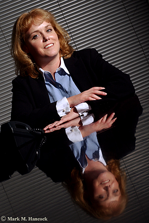
Heather Ainsworth, division director of Robert Half Finance and Accounting, poses for a portrait at her office in Dallas on Monday, November 22, 2004. She manages a group which specializes in full-time placement of accounting professionals.
Photos © Mark M. Hancock and The Dallas Morning News
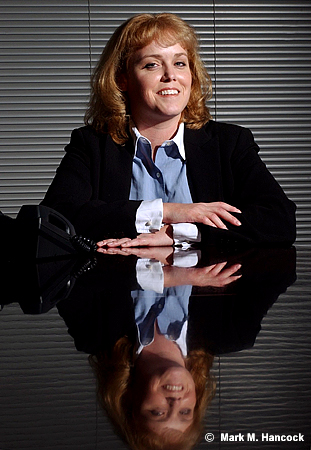
These are images from a tough situation. I could only shoot in their conference room. Compositionally, it's further complicated by having only one subject.
I tried to make the image more interesting. I snooted the light, I used her reflection on the polished wood table and I even tilted the frame. The non-tilted image ran as expected.
I'll admit a tilted view makes a boring image more interesting. There's the problem. Tilting a view is controversial to PJs because it makes a boring image more interesting.
The general composition rule is horizontal lines are horizontal and vertical lines are vertical because this is the way people see. Leading lines can be diagonal because they imply distance.
For those who tilt frames (deliberately turn the camera to violate the compositional norm), the rule is abstract and artificial. The rule can be considered a nuisance or an outright affront to creative expression.
For traditionalists, tilting frames is sloppy and unprofessional.
For most working PJs, it just happens. At other times, it's a tool to keep in the bag for when it's warranted. Sometimes it works, sometimes it's sloppy. Each image dictates its applicability.
To tilt
Most PJs have it hammered into our heads to make any situation visual or don't bother coming back to the newsroom. It's the PJ's job to sift through the scene and locate the single interesting image. When there is absolutely nothing – an extremely rare occurrence - a tilt may be warranted.
On equally rare occurrences, a tilt could be the only way to keep all visual elements within a frame. In these circumstances, the only other way to keep all the elements is to back up too far and include too much extraneous information that the image is degraded.
Lastly, the most legitimate use of a tilt is chaos. The PJ is running to or from something horrible and the camera was tilted due to other actions of the PJ. It's not a deliberate tilt as much as the PJ is darn lucky there are any useful frames at all.
No tilt
The strongest argument of the no-tilt camp is sloppiness or lack of creativity on the part of the PJ. If the PJ didn't work the situation hard enough, they may have simply tilted because it was an easy or faster way out of a situation.
In the viewfinder of most decent cameras are lines. These are normally part of the ground glass and vary from a single straight line with serifs to a complete grid. Many modern cameras allow the ground glass to be replaced with either preference.
While viewing the scene, PJs can align these guides to known standard bases to set the orientation and alignment of the frame.
To double check the tilt, most decent tripod heads have integrated bubble levels. I wouldn't suggest limiting the composition to where the bubble aligns, but it's a tool to use when the scene itself is somewhat askew.
Reasonable rule
Personally, my predilection is toward the no-tilt side. However, I understand compositional rules are meant to be broken at the right time with the right knowledge. A reasonable composition rule maximizes the use of the frame.
Locate one item within the frame to justify the vertical or horizontal pitch. As an example, it's relatively acceptable to match the frame tilt with a particular spoke of a bicycle tire or tree branch. Although the remainder of the frame is “tilted,” there is a defined “base” for the tilt.
Along this same line, when shooting ultra-tight, a tilt maximizes the frame by keeping the subject's main facial features within the frame while cropping the remainder. However, I'd still suggest some traditional frames before returning to the newsroom. If the tilted frame is interesting enough, an editor might be convinced with logical evidence to use it.
How to align in PS
There are two ways to align images in Photoshop. The measure tool method is easiest and most reliable. The crop box method is often required when multiple angles and/or a wide-angle lens are at play. Although it isn't as exact, it often looks better because the PJ determines what looks correct considering all the variables.
Measure tool method
As stated, this is the most exact method to align an image. It's often the easiest method when longer lenses are used because angles have less curvature.
While the file is open, move the mouse over the eyedropper tool. Click and hold the mouse until the alternative tools appear. Select the measure tool (it looks like a ruler).
Chose a straight line (vert or horizontal) within the image to use as a plane base. A longer line leads to a more accurate rotation. Move the cursor to one end of the line. Depress the mouse button and move the mouse to stretch the line across the entire length of the plane base. Release the mouse
To adjust the line, use the mouse to grab and move the plus symbols on the ends of the line.
Once a straight line is produced in the appropriate place, it's time to rotate the image. Go to "Image" and select "Rotate Canvas" then select "Arbitrary..." When the dialog box appears, it'll be set for the accurate angle rotation and direction. Hit "OK."
The image should now appear straight as set by the plane base. If not, "Undo" the rotation and try again until it appears visually correct. With ultra-wide images, very few things are going to be "straight" due to barrel distortion. As long as the crop line intersects a curve at an equal distance to maintain symmetry, it's close enough.
Next, crop the excess (background colored areas) from the image. The image is smaller, but it is properly aligned.
Crop box method
Because many tilts are accidental and only slightly off level, it might be best to align the frame in Photoshop before the final edit. The process is easy.
While the file is open, create a crop box. Stretch the crop edge along a chosen line (vert or horizontal). A longer line leads to a more accurate crop. Move the cursor outside the crop box until it makes a curved symbol. Depress the mouse button and move the mouse to rotate the crop box until the edge aligns with the chosen base line. Release the mouse button.
Next, stretch the crop box edges until they form a good crop while remaining completely within the image area. Move the cursor within the crop box and double-click to set the crop.
The image should now appear straight as set by the base element. If not, “Undo” the crop and try again until it appears visually correct. With ultra-wide images, very few things are going to be “straight” due to barrel distortion. As long as the crop line intersects a curve at an equal distance to maintain symmetry, it's close enough.
A Leeson lesson on tilts
David Leeson is known to tilt some frames. He wanted to voice his view on this subject as well.
The issue is to get your mind off it. It’s not about whether you tilt or don’t tilt. For me personally, it’s simply shooting in a way that communicates most effectively. With that said, I think people use tilting as a gimmick.Enough for now,
It’s so obvious they simply tilted the image because it makes it look cooler. I have a bigger pet peeve than that. I have a much bigger one and that’s people who put those really cool little black borders around all their stuff. These are digital images and they’re putting them like it’s a film edge. It almost always makes the image look cooler.
I just don't like gimmicks.
I've been guilty of it myself many times – using a gimmick. But I hate it whenever even I do it. I despise it. I look at myself and say, 'That's disgusting. Why'd you even do that?'
It's because you didn't want to give it the extra effort or you were completely, flat-out busted and couldn't think of anything else. You just didn't know what to do. You're stuck. It's a lack of confidence.
It's not knowing how to follow a story. You just didn't approach it right.
Think of some of the world's greatest images and then think about if they would be better if you tilted them. We don't do that. Do we?
On the other hand, think of some of the world's greatest images that are tilted. You'll find out when you look at those, they're not tilted because someone wanted to use a gimmick. They're tilted for a purpose or reason. Maybe it's because the photographer was running like hell. Maybe it's a grab shot. The whole point was that it was supposed to be from the hip, and it's supposed to have that kind of feeling. In other words, the photographer isn't even thinking about whether they were tilting or not.
A lot of the tilts that you see in my images, I'm not purposely tilted. I don't even notice it because I'm shooting quick. I shoot from the hip a lot.
I used to challenge young photographers to try sometimes on an assignment instead of seeing the image, try to feel the image. Try to shoot by what you feel, not what you see. Get rid of what you see. Practice actually experiencing the feeling of that situation.
A lot of times when I was doing that, I wasn't even looking through the camera. Obviously, it wasn't always straight either because I'm not lining it up.
I don't really think about it myself. I have some tilts. Sometimes I don't. I don't really know. But, I do not ever knowingly say, 'This would look cooler tilted.' I just don't do that. I don't even think about it.
If you look at Eugene Richards, his stuff is tilted like crazy. Now, he's an amazing photographer, no one is going to question the brilliance of Eugene Richards. Yet, so much of his work is tilted.
But if you really study those images, you'll see that it's tilted for a purpose. Look at what he included in the frame. Those tilts have a purpose behind them. I promise you, go and look at that work. It’s absolutely amazing because you can see how the tilted frame included some detail in the frame – additional content perhaps – that helped make the image.
The only way he could have got it in there using the lens length that he was using would be to tilt it. You'll see it. So it's not a gimmick.
Friday, December 17, 2004
Where to crop
While I struggle with plain ways to explain horribly complicated photographic problems, I'll offer some simple suggestions for the next few days.
Where to crop
Don't crop (in camera or afterward) people or animals at a joint (elbow, knee, ankle, etc.). If a crop is at a joint, it makes subjects look like they're missing body parts.
Instead, crop into straight portions of limbs or the body.
While we're on the topic, crop mid-pelvis on frontal views instead of near the top of the thigh. Trust me on this one. It will only make the PJ's life easier.
Lastly, since we also tend to make ultra-tight face shots, crop slightly above the hair line on folks with hair. For those folks like me, crop mid-forehead to spare them the shiny results of stress and too much testosterone.
Enough for now,
Saturday, November 13, 2004
Have dark corners
We recently discussed image skeletal structure. The first step for a sound structure is to put something dark in all four corners - even if anticipating a crop. This creates a frame to hold the image together under any circumstance.
Most newspapers place a black border around images to mark each image's boundaries and separate it from other page elements. However, it's not wise to assume the borders always appear on the image.
If something goes wrong during pagination or paste-up, the image's dark corners hold the image together on the page and give the viewer some visual guideposts as to where the image stops and the page begins.
Many smaller black and white newspapers still make image halftones and do not use rule lines. This means all the white areas of a photograph "bleed" onto the page. At these publications, it's critical to put something dark in each corner. Otherwise, parts of the image simply float in a sea of words.
With fine art images, darker corners are almost required. Fine art pieces are frequently matted on white or museum board (cream). The mount almost dares fine artists to try Zone X near the edge.
At least PJs' mat boards are black. In college, I used gray board with a black core (very cool). Now, I have a super-special brass matt cutter with all the bells and whistles. I rarely use it, but someday...
How to make dark corners
Often, a look at the scene dictates what to avoid. Obviously, try to keep anything white or brightly lit areas away from corners and choose to put darker objects into the corners of the image.
Sometimes this may require PJs to crawl under a bush or frame the shot with some other foreground object. Another way to darken the corners is to pump-up the strobe a stop or two and drop down the ambient light (set flash to +1 and meter at -1 or greater).
Avoid afterimage work
Although it's possible and accepted practice to burn down corners or slide the curves in Photoshop, try to avoid it.
Instead, concentrate on making a good composition from the start and the image can go from the camera to the page quicker. Sometimes, there simply isn't time to work the image before delivery.
I'll save potassium ferricyanide treatments and W. Eugene Smith discussions for another day.
Enough for now,
Monday, November 08, 2004
Make strong skeletal structures

This image (top) is a good example of image skeletal structure. See how the elements are separated physically as well as tonally.
Note the importance of structural composition as color is removed (middle).
The lithographic final image (bottom) shows the skeletal structure of the image and how it's capable of transferring from color to B&W without major concern.
Mark M. Hancock / © The Dallas Morning News
Notice: This entry is for advanced PJs. Pro PJs understand it. Most others might. Some won't. Don't fret. I'll fill in the missing gaps soon.
Each image has a skeletal structure. This structure is the framework of light and dark patterns within an image. PJs who start with black and white photography understand this theory faster than strictly color photographers, but it applies to both genres.
The goal of the skeletal structure is to keep items orderly and separate within a scene. Additionally, the structure leads the viewer's eyes to areas designated by the PJ.
What's a scene
Before we understand the visual structure of a scene, we must define what a scene is. A scene is any collection of visual information. A scene can generally be defined as a physical area where something occurs (a fire or police scene). It can also be defined as a view or fragment of the overall scene contained within the viewfinder or final image area (an image scene).
Since the viewer of photojournalism is limited to areas PJs choose to document, the final image is the most common definition.
Understand structure
The first step to understanding structure is to understand tonal gradations and how the dynamic range of light works. PJs must understand white can be black and black can be white. It simply depends on the amount of light reflecting from the object in relationship to other items in the same scene.
Once this initial concept is understood, PJs can visually arrange elements within the scene through the viewfinder. Light areas can be placed and contained within dark areas and vice versa until the best structure is accomplished. The goal is to separate or join items through the use of contrast and tonal gradations.
The areas reflecting the most light become the "bones" of the skeletal structure or the reverse can be true (for high key images). PJs then visually arrange these elements to keep viewers' eyes within the frame without letting other elements intrude into the scene or particular elements within the scene.
Highly-sophisticated structures may contain several light/dark patterns layered within one another in addition to spatial layers of depth.
See the structure
PJs must see structures and quickly assemble them into a logical, organized order. When PJs are covering a fire or a hostage standoff, it's not the best time to wonder what to do or the time to do the wrong thing.
There's several ways to preview a scene. I'll explain the classical approach first to avoid confusion (although it's arguably more confusing). PJs tend to use a personal variation of the final method for most news situations.
Preview button
Most SLR cameras have a depth-of-field (DoF) preview button on the camera body to the right (left as looking at the camera lens) of the lens mount ring. I'll soon explain hyperfocal distance (and depth of field) to dispel the myth about this button, but for today's discussion, it's a useful button.
SLR cameras open lens diaphragms to allow the PJ to view a scene through the maximum (widest) aperture setting of a lens. This allows the most light to travel from the scene to the PJ's eye regardless of the actual aperture setting.
For example, if the camera works properly, the PJ sees the scene at f/2.8 although the aperture is set for f/8. When the shutter release button is depressed, the camera moves the aperture arm and constrict the diaphragm to f/8 for the actual exposure. Then it returns to the maximum aperture setting as the mirror moves back into place.
To see the scene as the camera sees the scene, PJs depress the DoF button. It overrides the aperture arm and constricts the lens diaphragm to the set exposure (f/8). Without getting into the technical issues, the end result is less light travels from the scene to the viewfinder. The scene within the viewfinder becomes darker and objects within the general depth-of-field become more defined as the circles of confusion become smaller.
While the button is depressed, the tonal variances become more evident and color saturation becomes less relevant. As an example, a red apple on a green tree under even light becomes about the same shade of gray.
On B&W film without filtration, they'll be the same color gray because they're within the same tonal range of reflected light (although they reflect different wavelengths in the electromagnetic spectrum and are measured at different Kelvin temperatures).
Confused yet? Wait until I discuss calculus as it applies to artificial light and some of the other really exciting mathematical and scientific aspects of photojournalism. ;-}
For now, the PJ has the DoF button depressed and is looking through the viewfinder. Notice how differently the scene looks. The scene is broken down into light and dark areas because the eye can't fixate on objects separately. This is how the film or CCD also sees the scene.
Squint
The fastest and easiest way to see a scene's structure is to squint. Essentially, by squinting at a scene, PJs stop-down their eyes by reducing the amount of light entering the eye and break the scene into light patterns.
Did I hear a sigh of relief?
Most PJs have learned, either classically or through trial and error, how to see light patterns instead of the actual scene. They use variations of a squint to place foreground objects into contrasting background areas.
As the Moody Blues speak in "Late Lament,"
Cold-hearted orb that rules the night
Removes the colours from our sight,
Red is grey and yellow white
But we decide which is right
And which is an illusion.
Arrange the elements
Once PJs recognize light patterns within the scene, they arrange them within the viewfinder. On a simple image, the pattern is used to separate elements from one another or isolate one specific element from the surrounding elements.
Most frequently, a person's face is placed inside an evenly dark or light background element. PJs try to work foreground objects into background areas which are thrown off the dynamic range. This eliminates texture from the background and makes a "clean" background for PJs. Selective focus, lens choice, camera angles, and directional as well as artificial lighting further assist this goal.
However, the point is to bring some order to the chaos of most scenes. This is accomplished by arranging the scene elements into a solid skeletal structure.
Enough for now,
Subscribe to:
Posts (Atom)

